Design Prompt 1 • Tequila & Beer Labels
Feeling Stuck? A great way of breaking out of a creative rut is to work on a design prompt or passion project. Being that we have limited time at the studio – crafting small, manageable prompts works best for us to break away from client work & get the creative juices flowing.
In the spirit of Cinco de Mayo, we decided it’d be a fun prompt to design beer and/or tequila labels.
The brief, we’ll loosely call it:
01
Choose Tequila or Beer
02
Tequila – Name: “Mariposa” (butterfly in Spanish). Butterflies are symbolic for good luck
Beer – Name: “Serpiente” (serpent in Spanish). Serpents are symbolic of a creative life force and “God of the Ocean”
03
Establish WHO your customer is (ex. adventure seeker, life of the party, hipster beer lover). This doesn’t have to be super in-depth, just a few keywords will suffice.
04
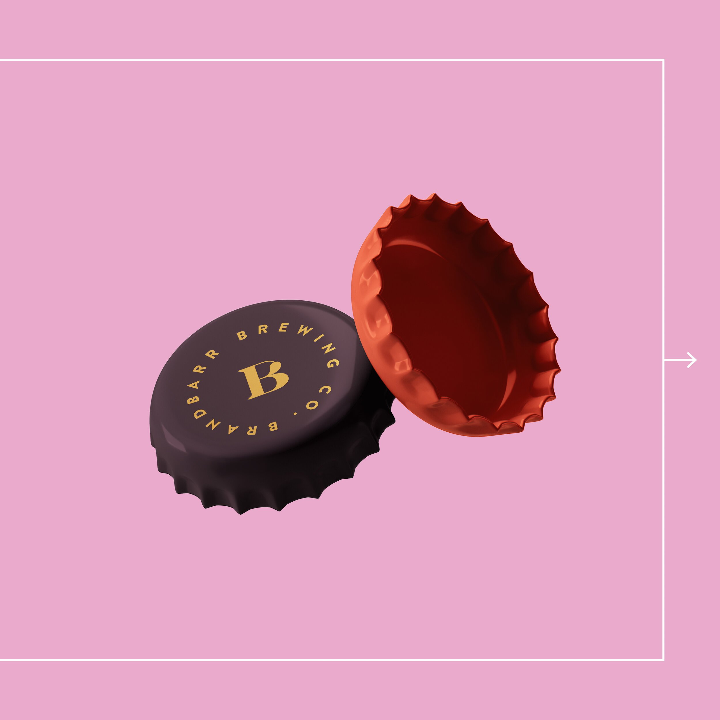
Based on your persona & keywords, create at least 1 bottle/label and mock it up! If you have extra time or feeling inspired by the prompt, add on another mockup (ex. coasters, beer bottle caps, etc.)
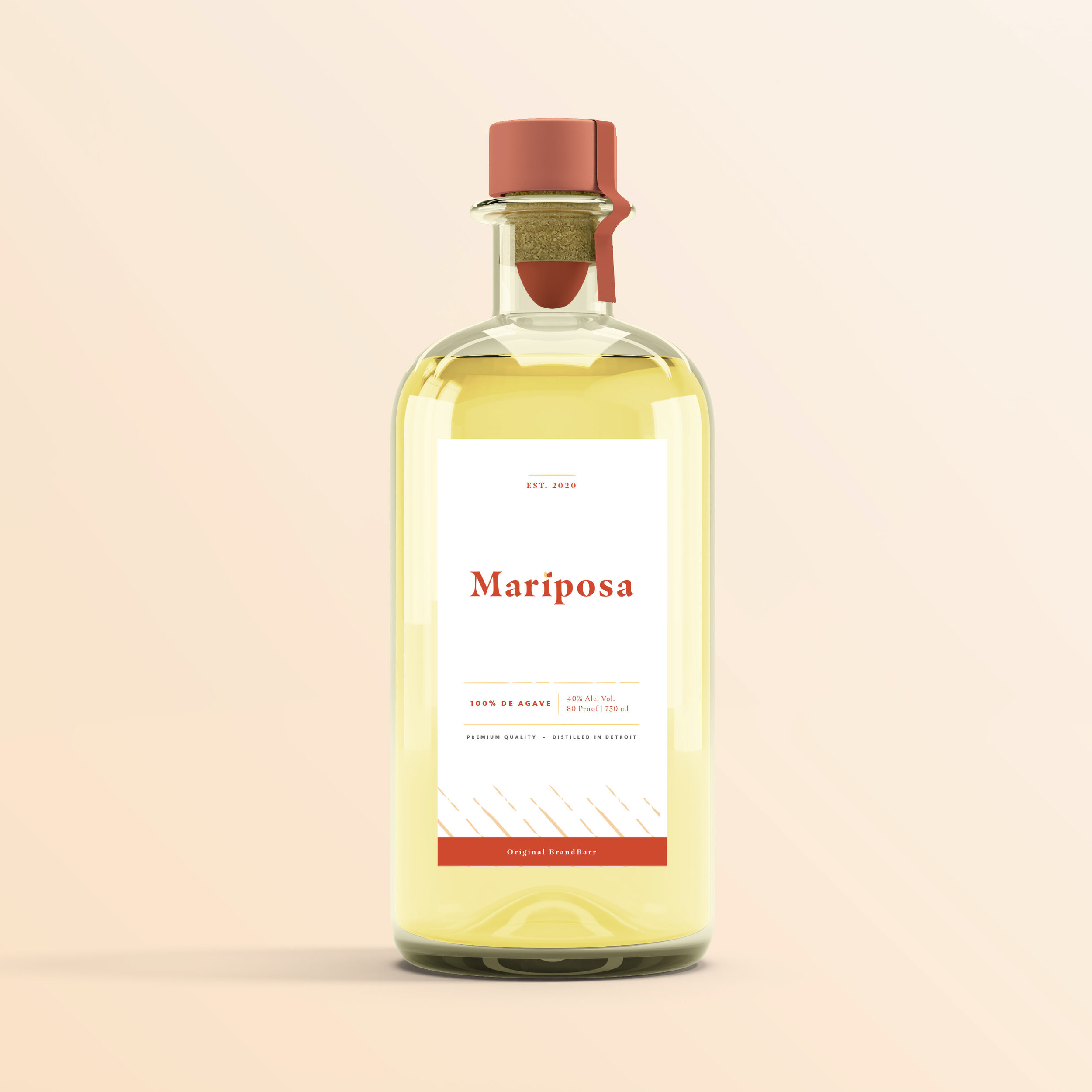
Mariposa Tequila • Designed by Alicia
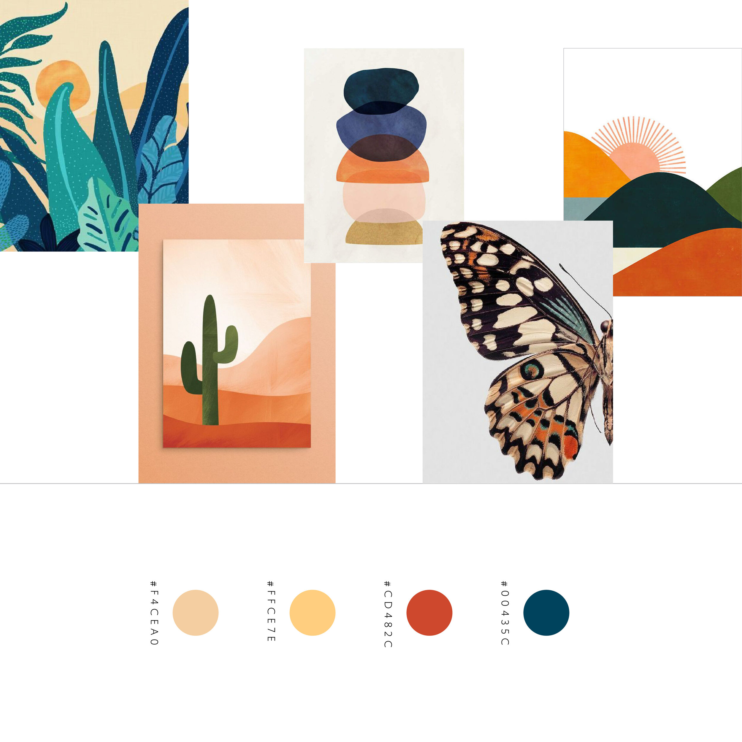
I started by gathering research and inspiration around how tequila is made and were it comes from. “Mariposa” is Spanish for butterfly, so I also looked at butterflies as a source of inspiration for my design.
When it came to color I pulled my palette from a variety of different butterfly types as well as different landscape settings. Knowing that the agave plant is many times found in red volcanic soils, I also explored different orange and red tones that could be used.
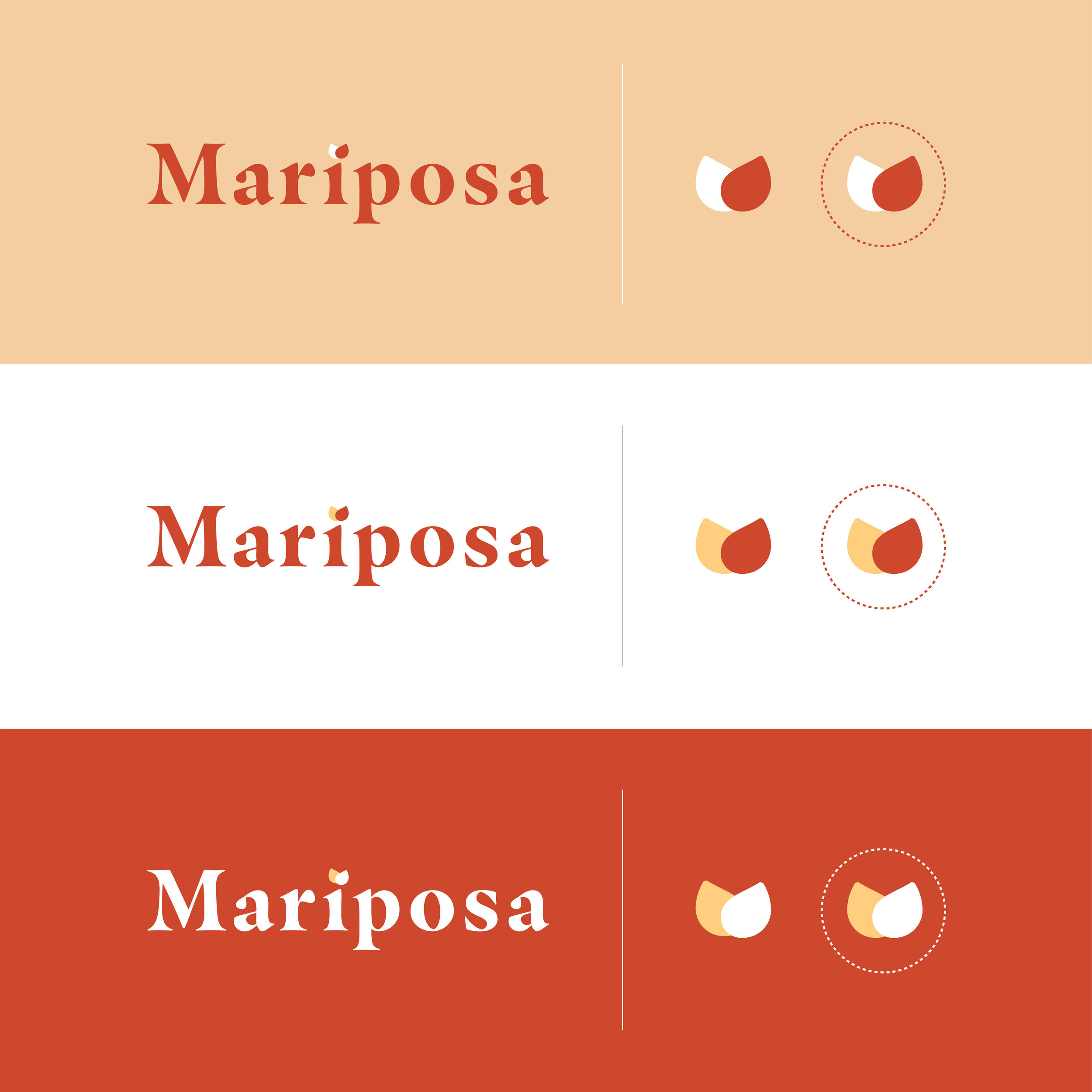
I selected a bold chunky serif font as the main logo font because I felt that it had a nice personality that matched the boldness of the name “Mariposa”. I created an icon that was formed from the dot of the “i” which was then duplicated and rotated. This icon is a subtle representation of the top of a butterflies wings.
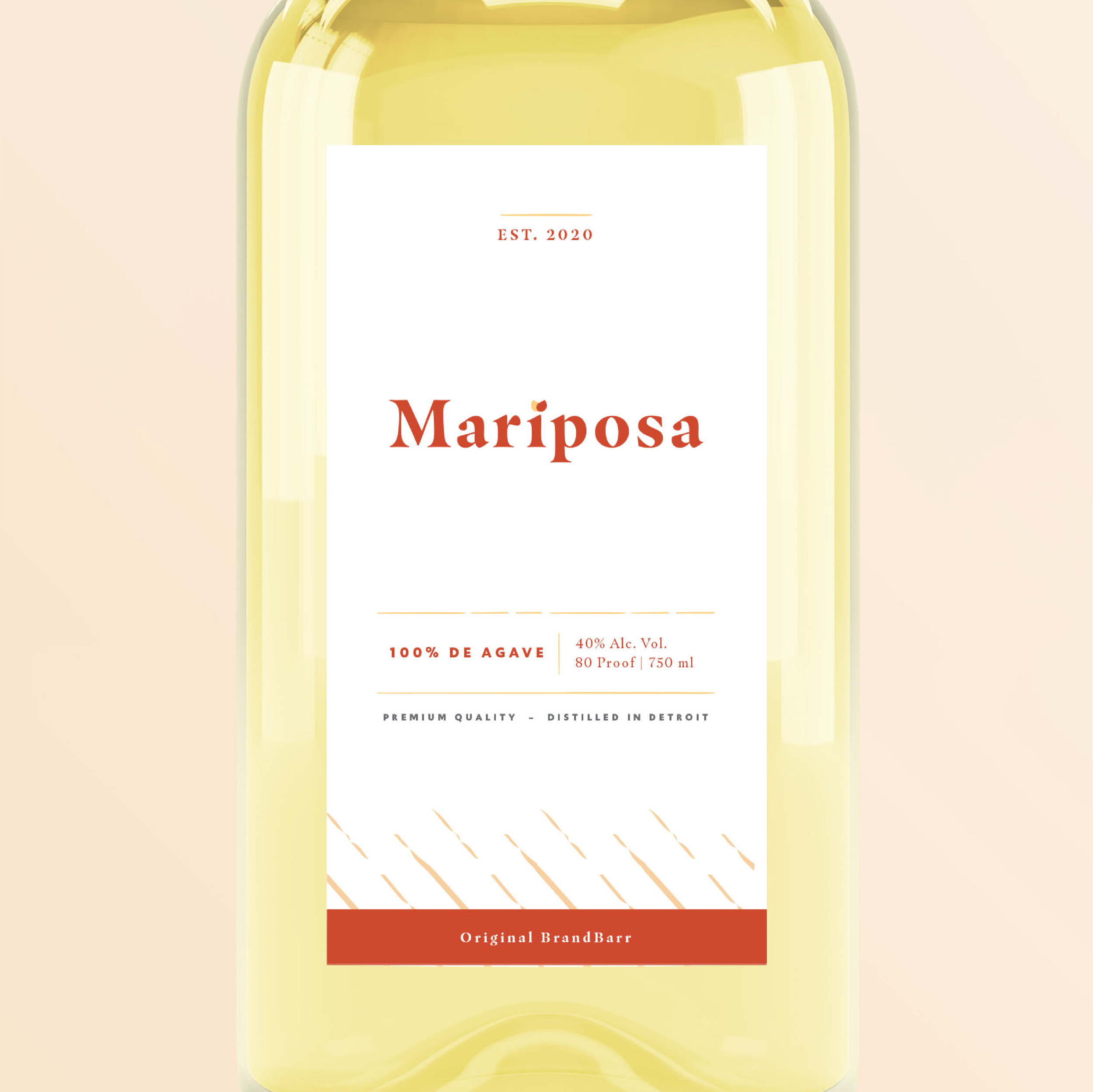
Much like the purity of the tequila, I created a layout that was minimal and had structure. I developed hand drawn line elements that contain the information and this was inspired by the lines found in butterfly wings.
– A
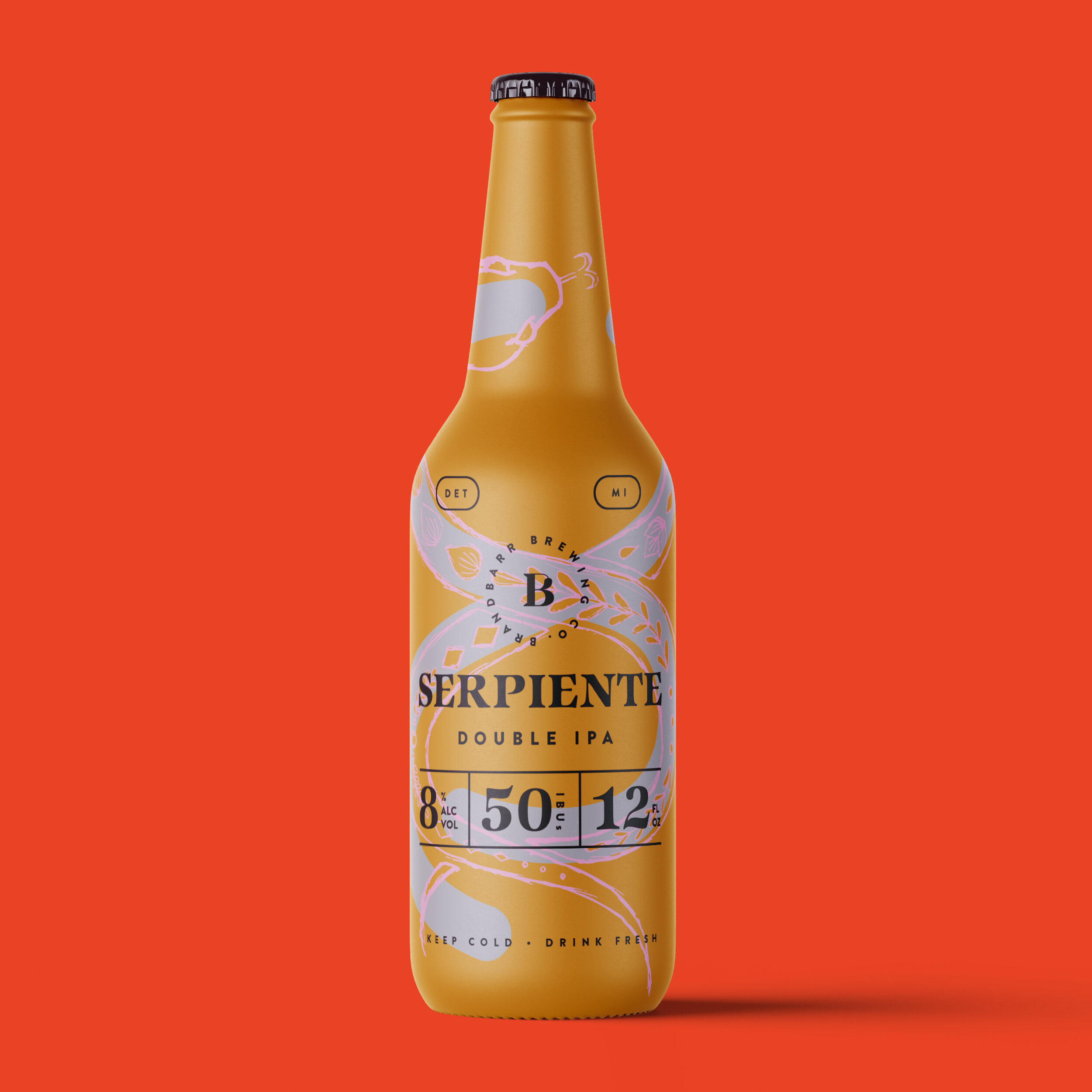
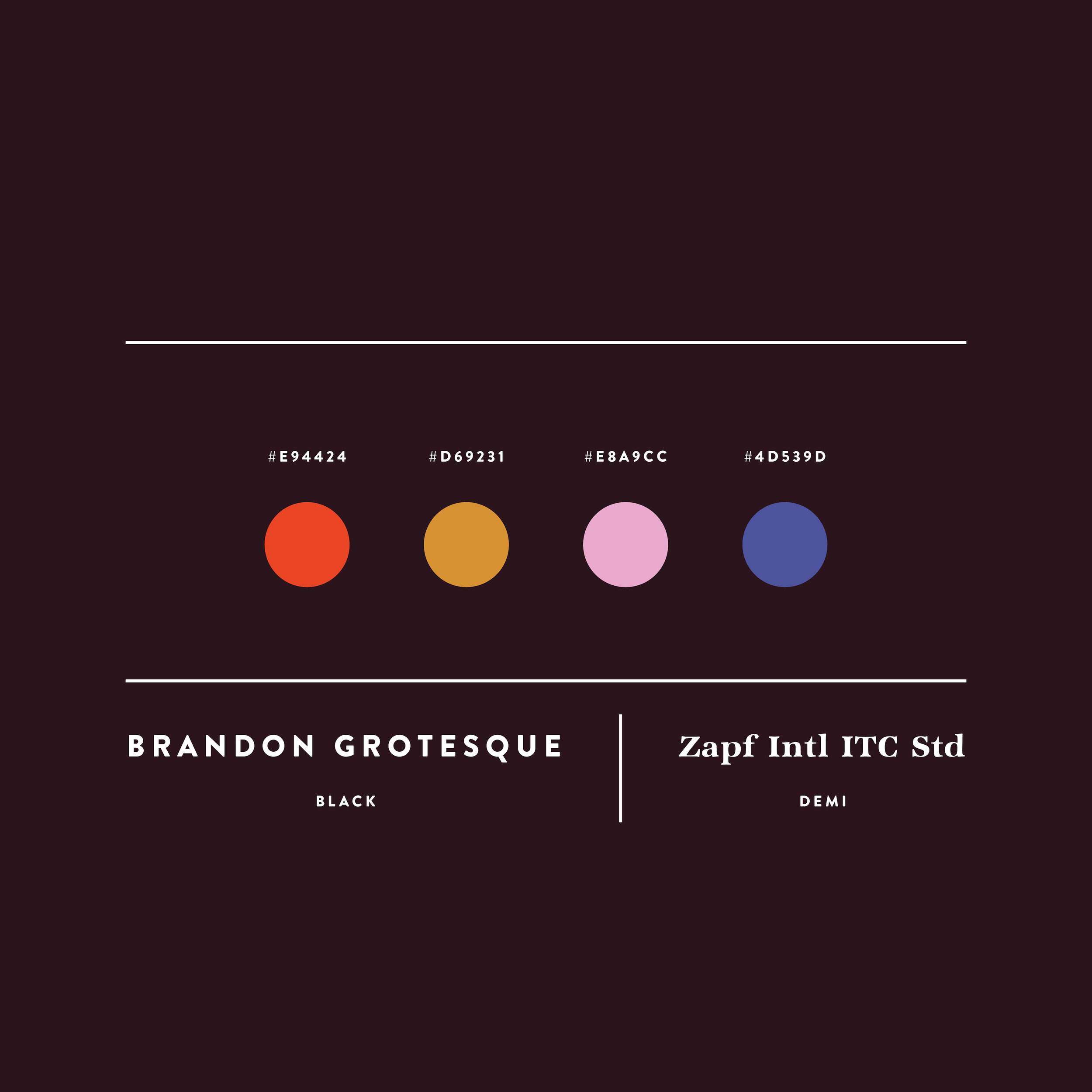
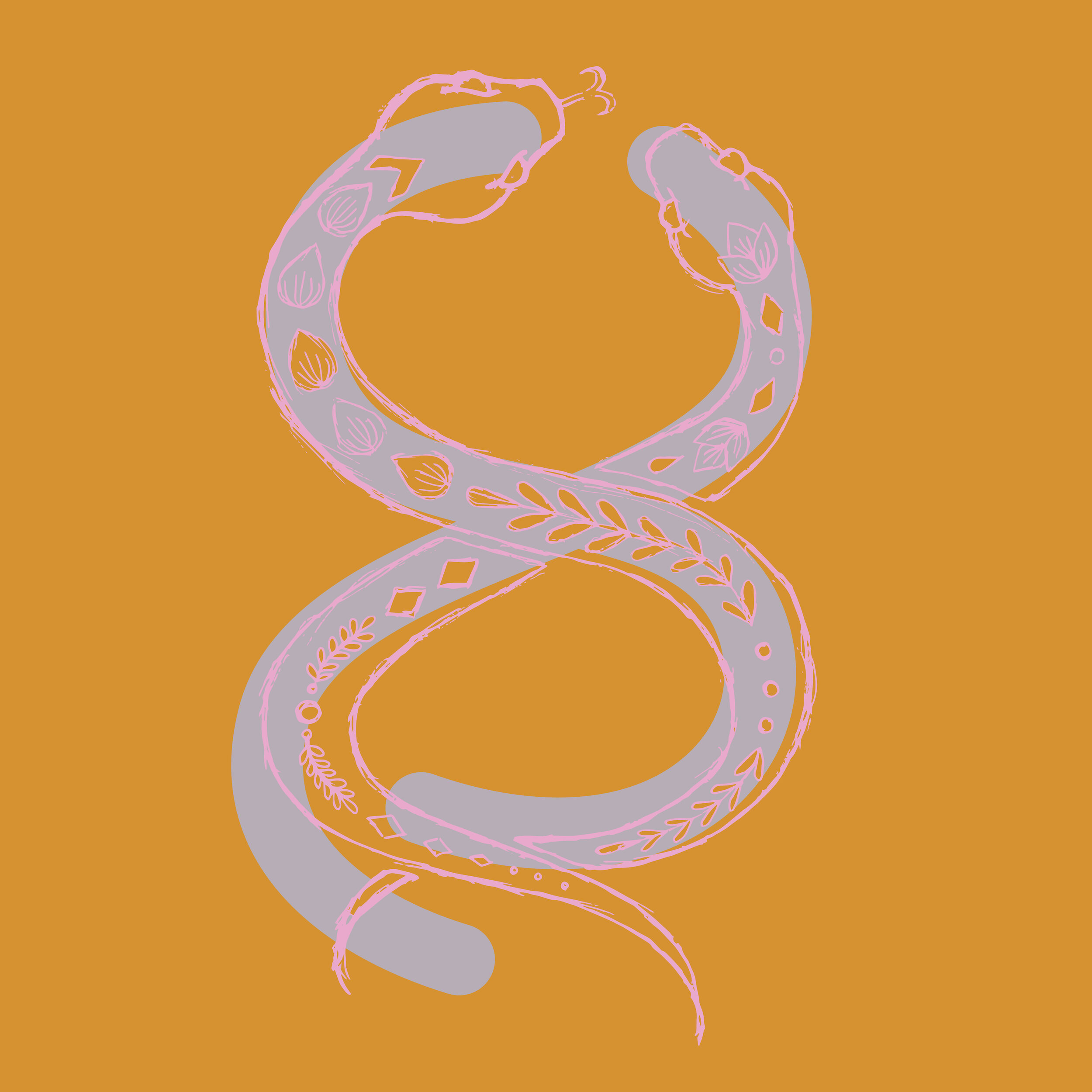
Serpiente Beer • Designed by Genevieve
Alright, let’s dive right into my design choices & what lead me to them.
I thought there was a nice duality with the “Double IPA” and snakes. Originally I was inspired by a siamese snake, BUT then noticed the 8% ABV and ultimately felt that drawing 2 overlapping snakes (representing double) and forming an “8″ of sorts was the best route to go.
The persona I crafted was a “Thrill-Seeker” – living life to the fullest – perfectly imperfect – full of adventure. I wanted the colors to reflect a bright energy, drawing you in closer, similar to the allure of snakes. I deliberately chose to hand-draw the snakes to add a human quality, connoting care in the craft of brewing beer and embracing imperfections.
– G