Design Prompt 2 • Album Art
Music fuels creativity and is able to transport one emotionally. It’s only appropriate that we chose to design album art for our current or past favorite songs/albums/artists.
The brief :
01
Pick a favorite song, album, or artist and recreate their album art.
02
There are no rules – let the music guide you!
03
Showcase your process & design elements through various compositions and mockups.
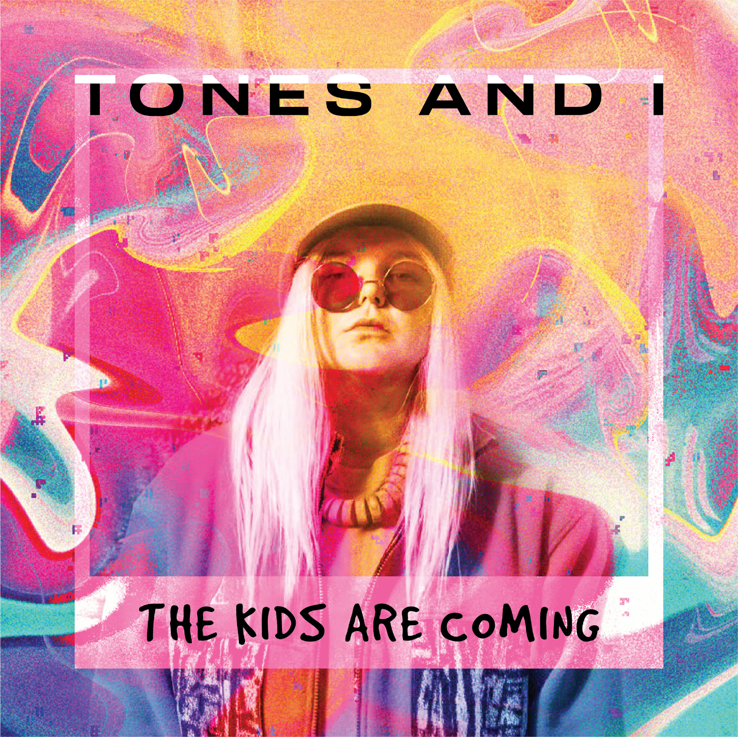
Tones and I, The Kids Are Coming • Designed by Alicia
I designed the album cover for “The Kids are Coming” by Tones & I, released in August of 2019. I chose to design for this particular artist, not only because I love her unique voice and musical approach, but also her inspiring back story. I played this album on repeat while designing so that the visuals I created related to the feelings I got from her music.
The vibe of her music and her overall style led me to explore photo manipulation techniques to create a bold, fun background using neon-colored photography. I came across a Skillshare class that went over various Photoshop manipulation techniques and it offered a new lens to what was possible. This step of exploration and experimenting was a lot of fun! As far as my typography choices, I landed on a clean, extended sans-serif and a playful handwritten font. I felt that these fonts best reflected the bold, raw energy that Tones and I brings to her music and fashion.
Here’s the Skillshare class I watched for Photoshop photo manipulation
– A
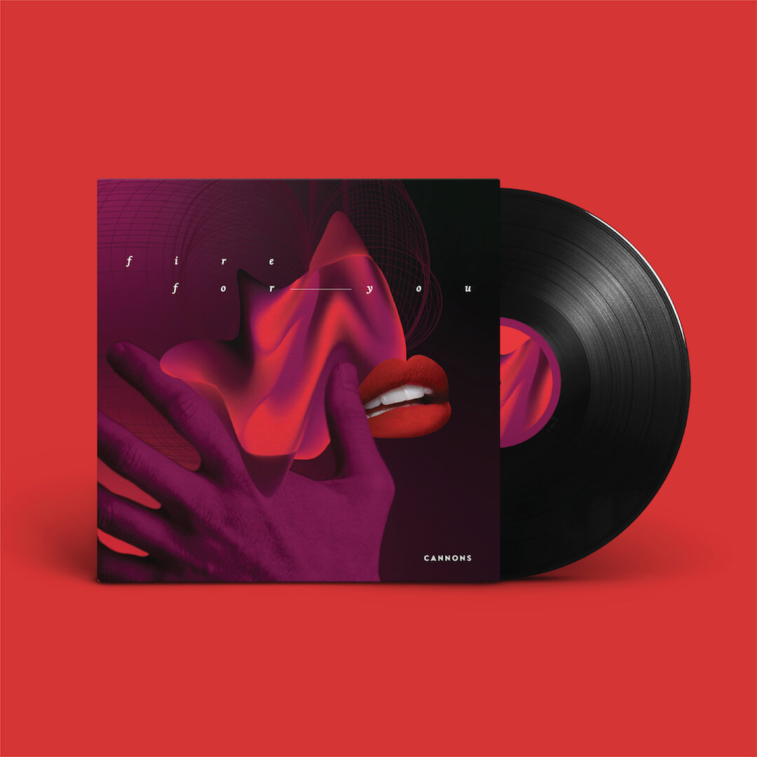
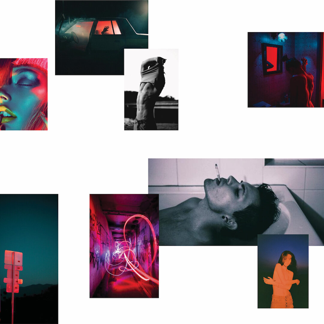
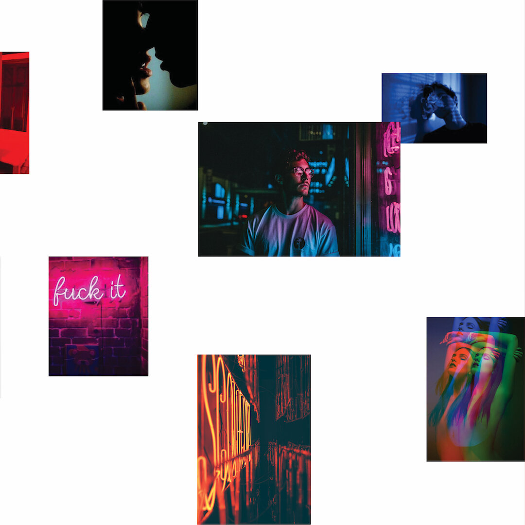
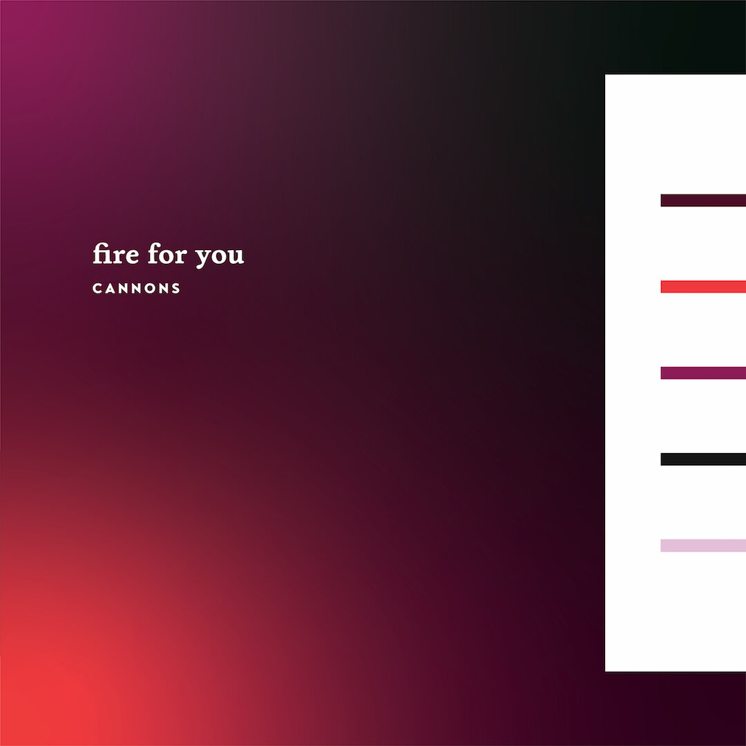
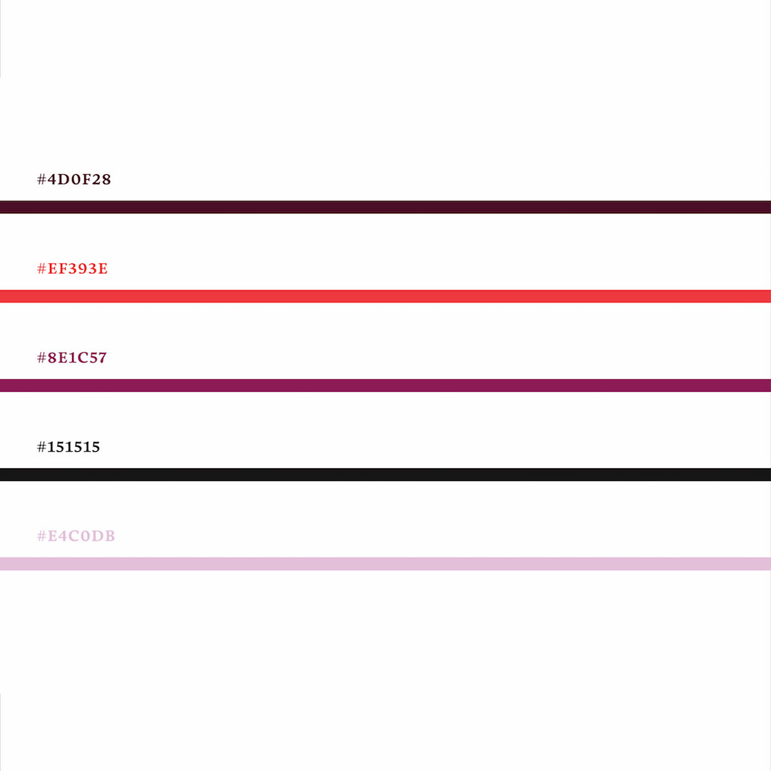
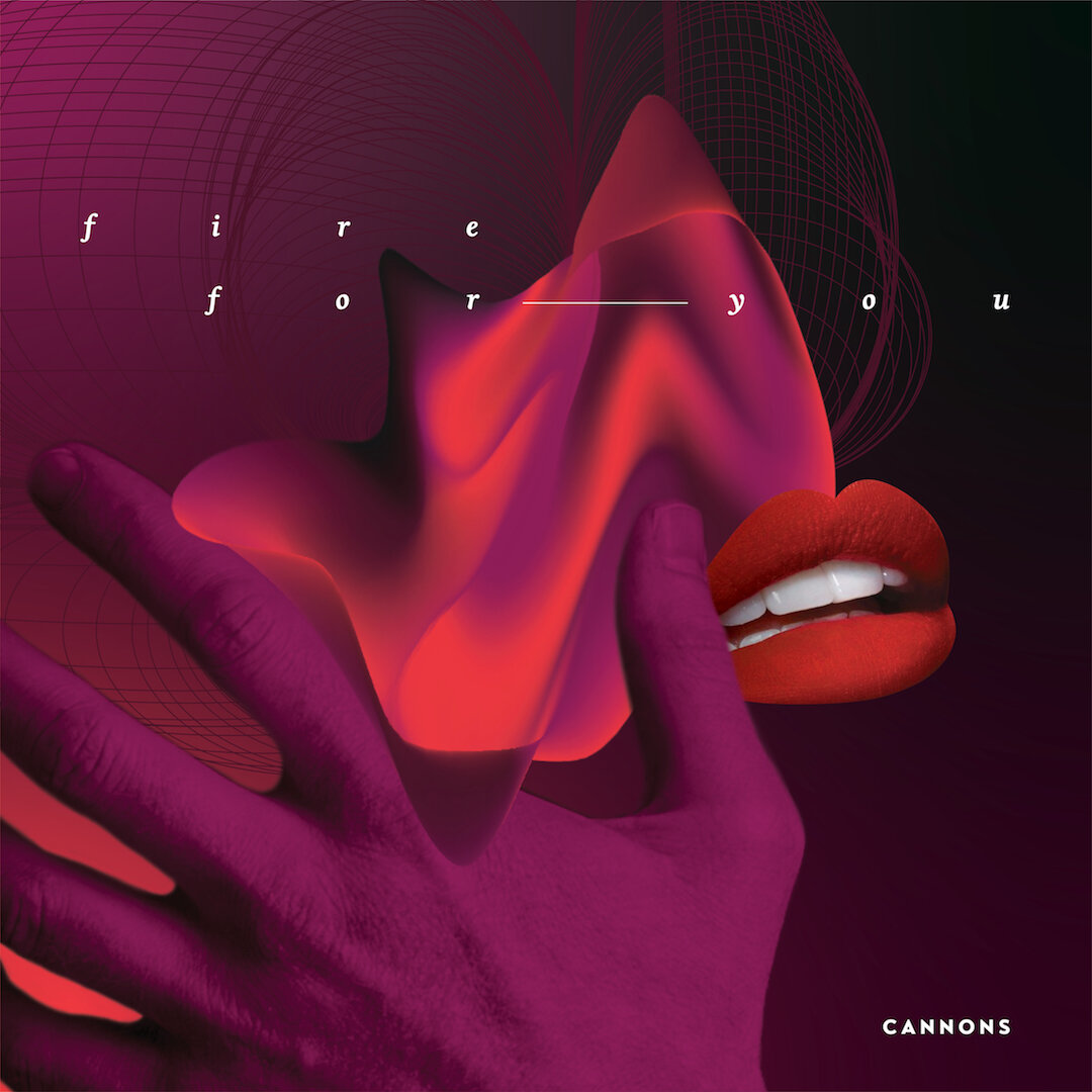
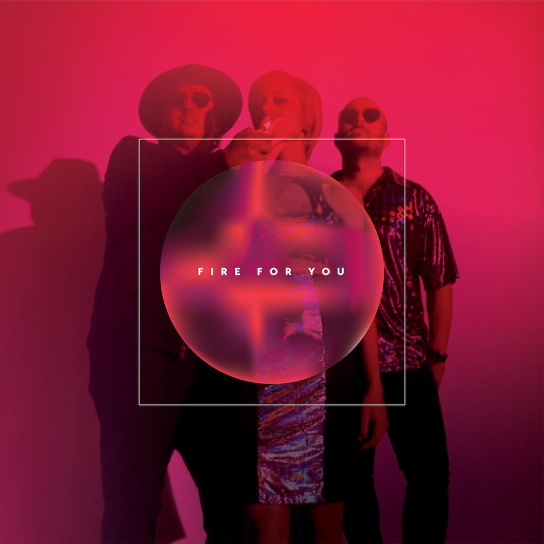
Cannons, Fire for You • Designed by Genevieve
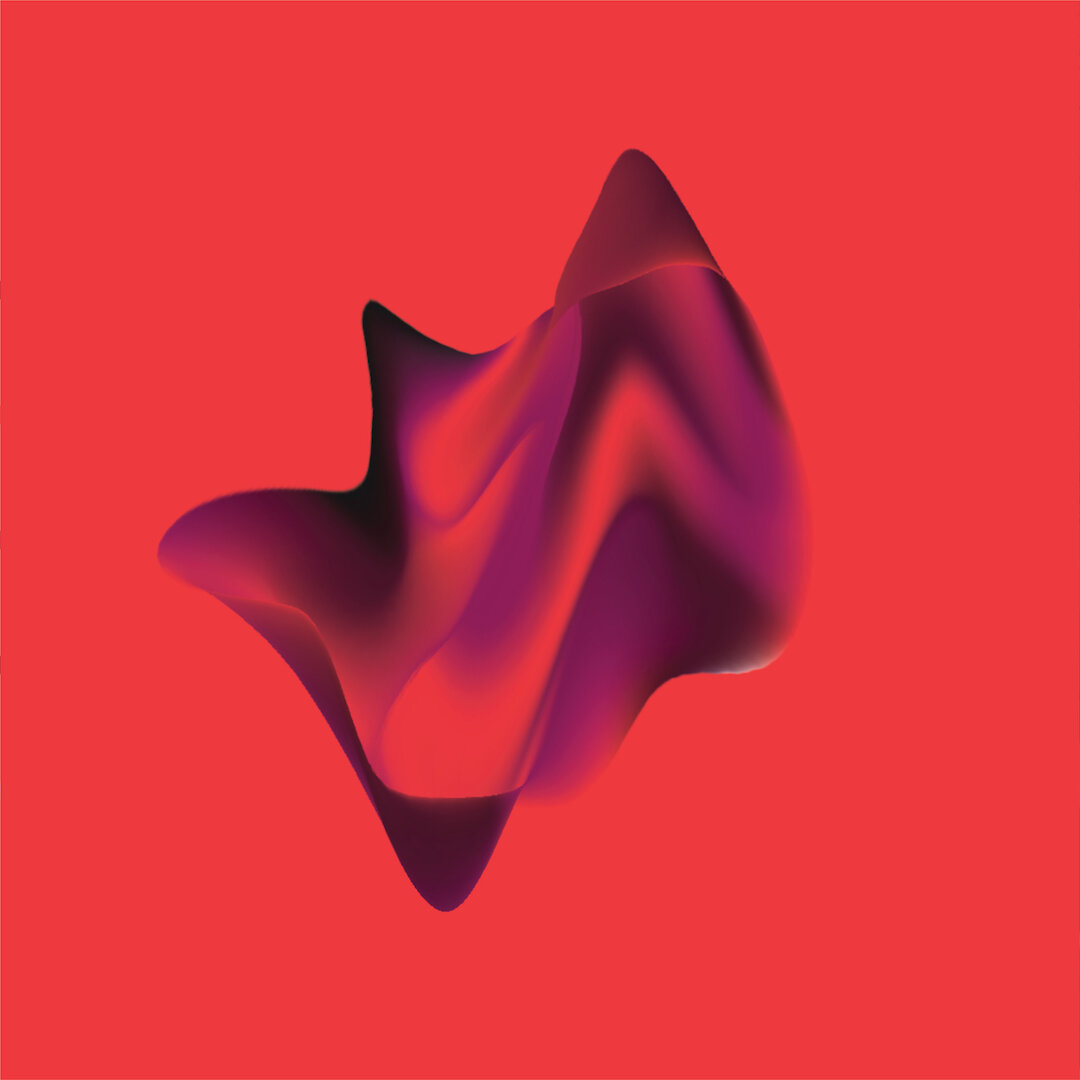
Do you ever hear a song and it just stops you in your tracks? I’ve probably listened to “Fire for You” by Cannons way too many times, but hey, I just really love it. This song instantly puts a smile on my face and gives me all the nostalgic, chill, seductive vibes. Everything from inspiration to colors, shape/form and imagery were chosen purely based on the way this song makes me feel. To me, it symbolizes a new flame – that feeling of being alive – heart-sinking, melting desire and spontaneity – simplicity and bliss – and sometimes, heartbreak.
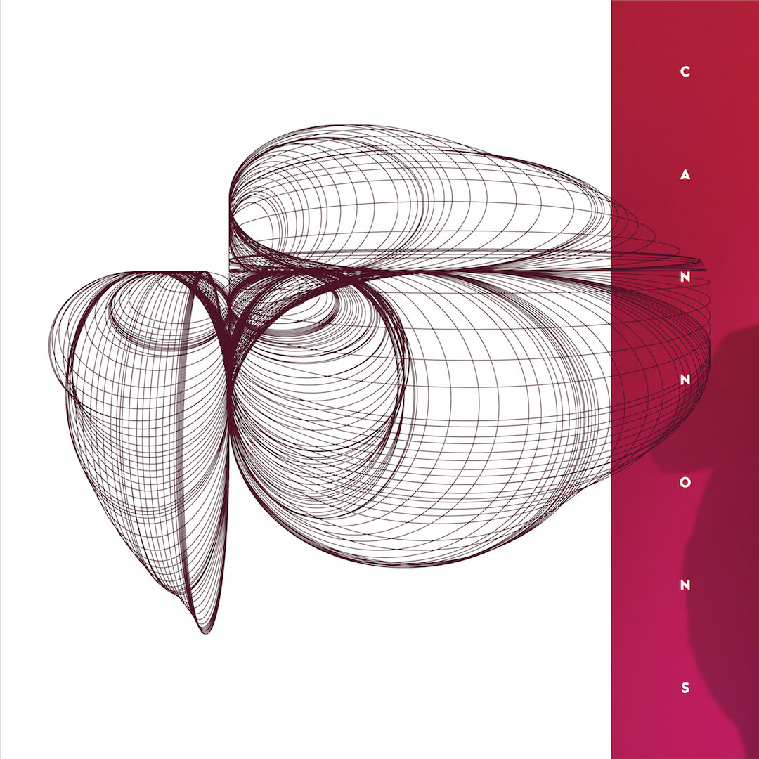
For this prompt I chose to use shape manipulation to achieve a 2-D melting effect. Along the way I stumbled upon another interesting short command in Adobe Illustrator (shift + ~) that creates repeating shapes as you click & drag (SO COOL!). I’ve always wanted to explore digital collage and felt this prompts was a great opportunity to do so. It’s always been my opinion that when you remove or don’t include eyes in a composition you’re able to place yourself in – making the image feel more relatable, triggering certain feelings/emotions and memories. Overall, my intent was to create album art that felt sexy and deep.
Check out the Skillshare class I used for the 2-D shape warping & repetition!
– G
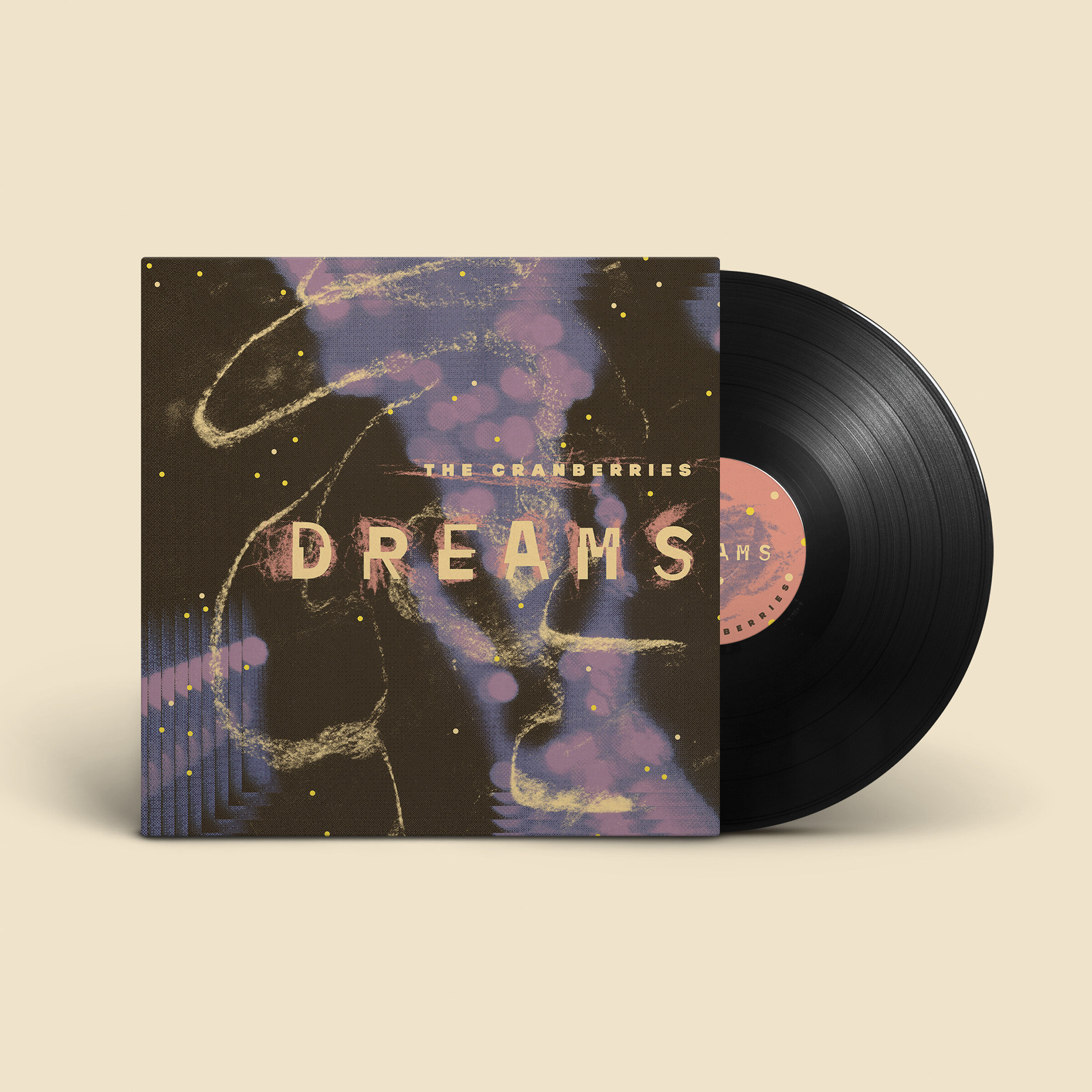
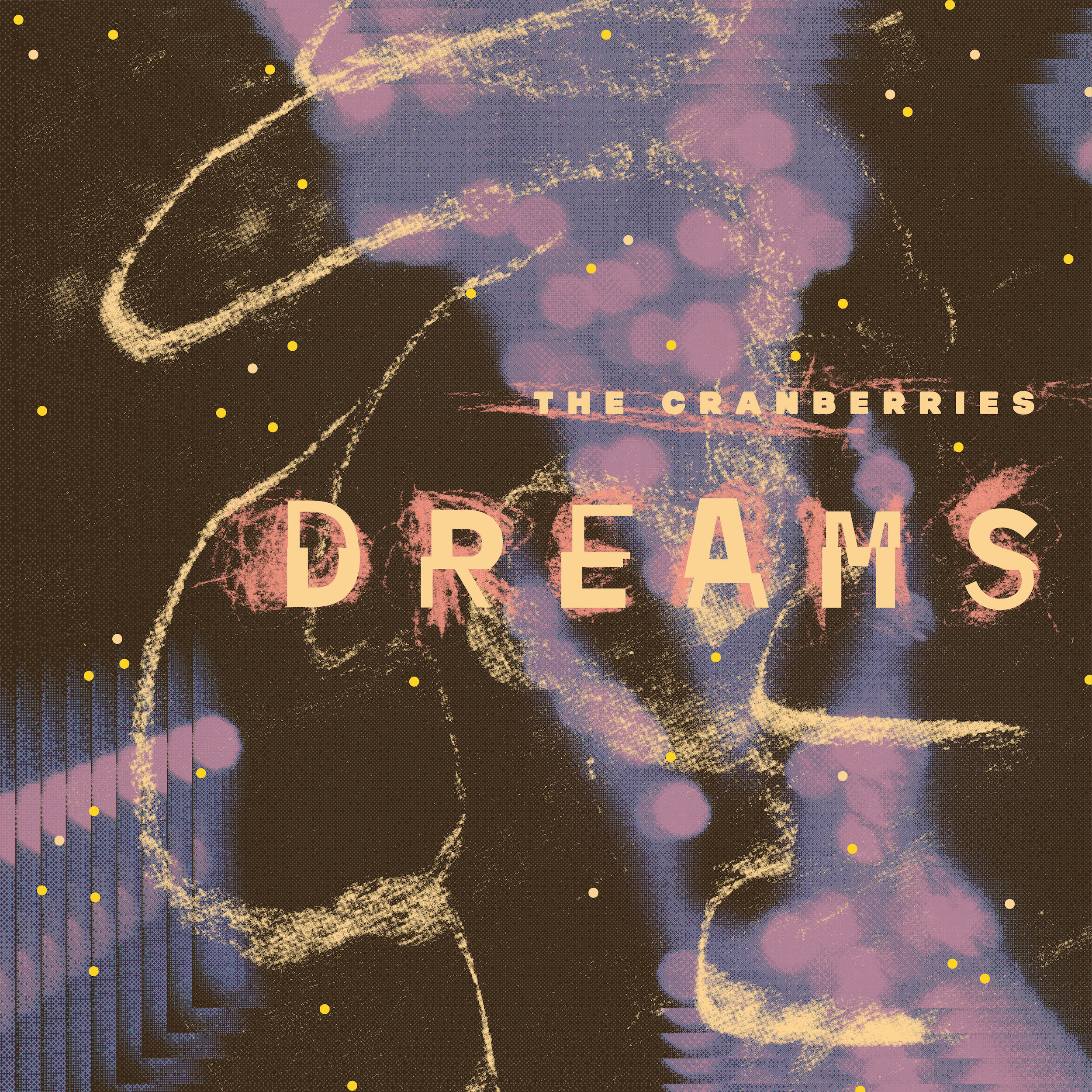
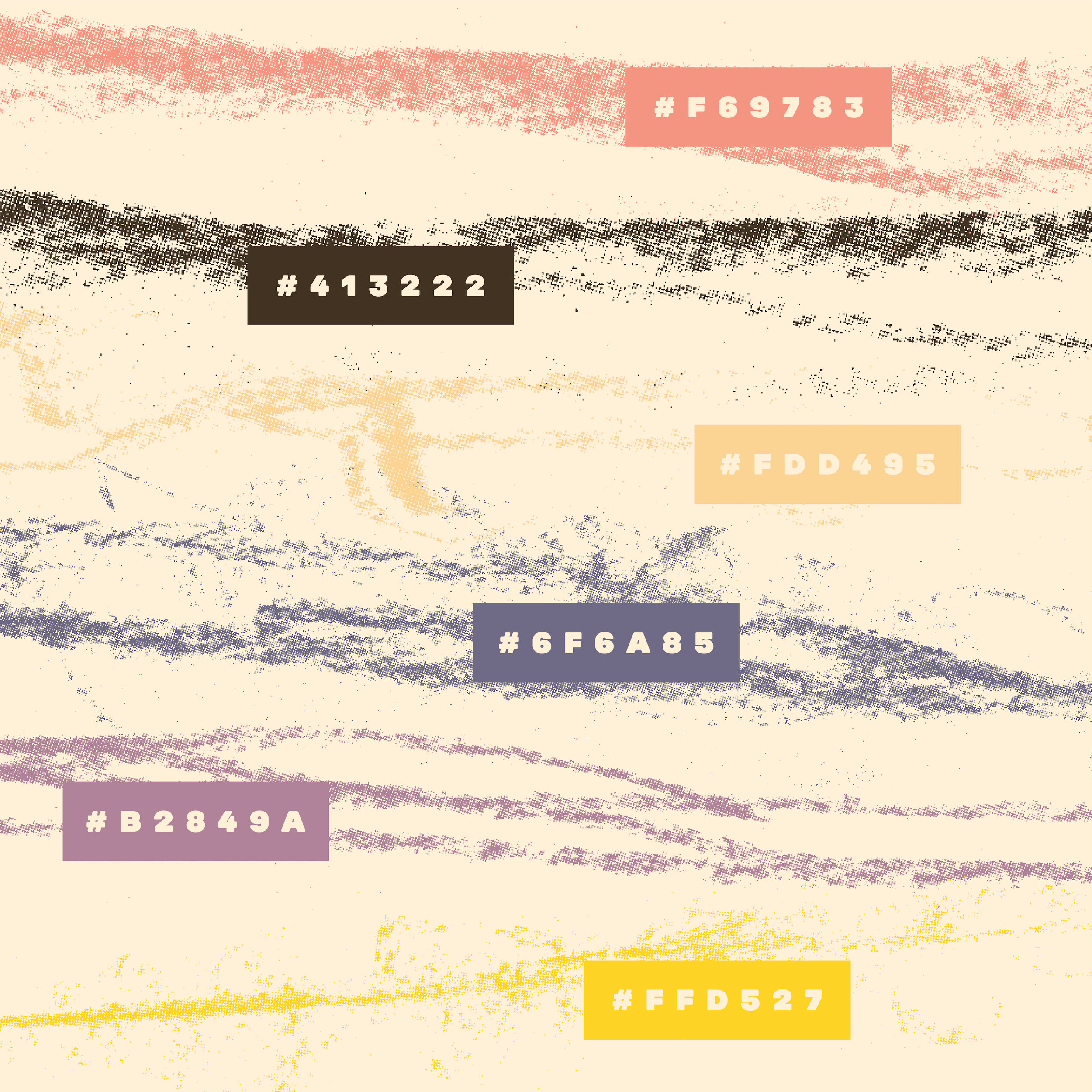
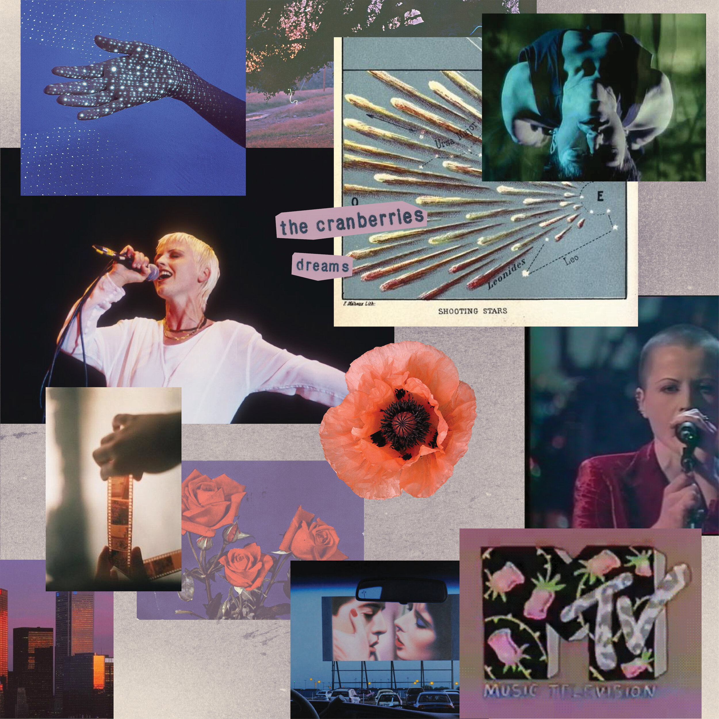
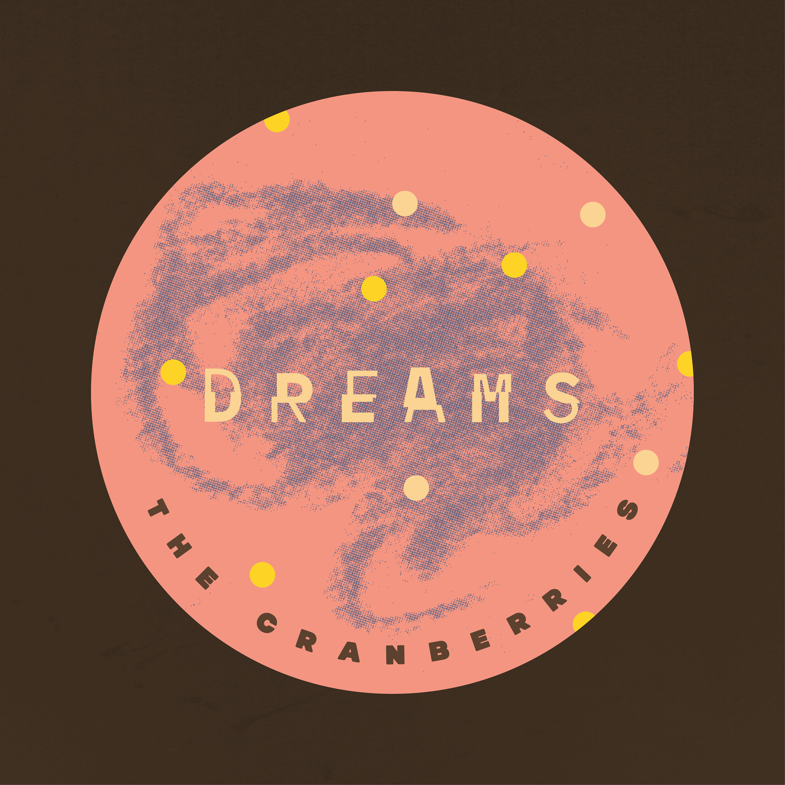
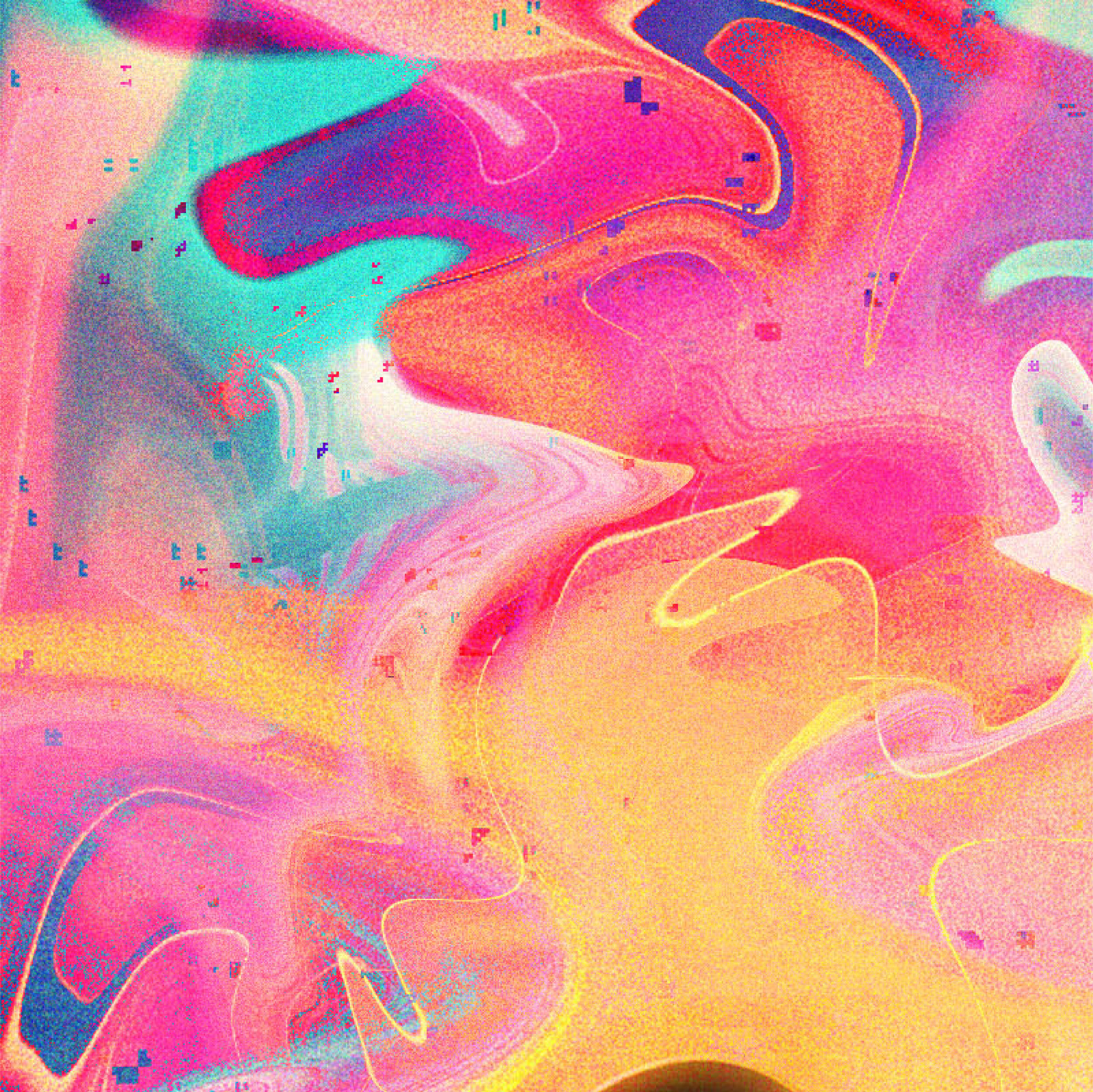
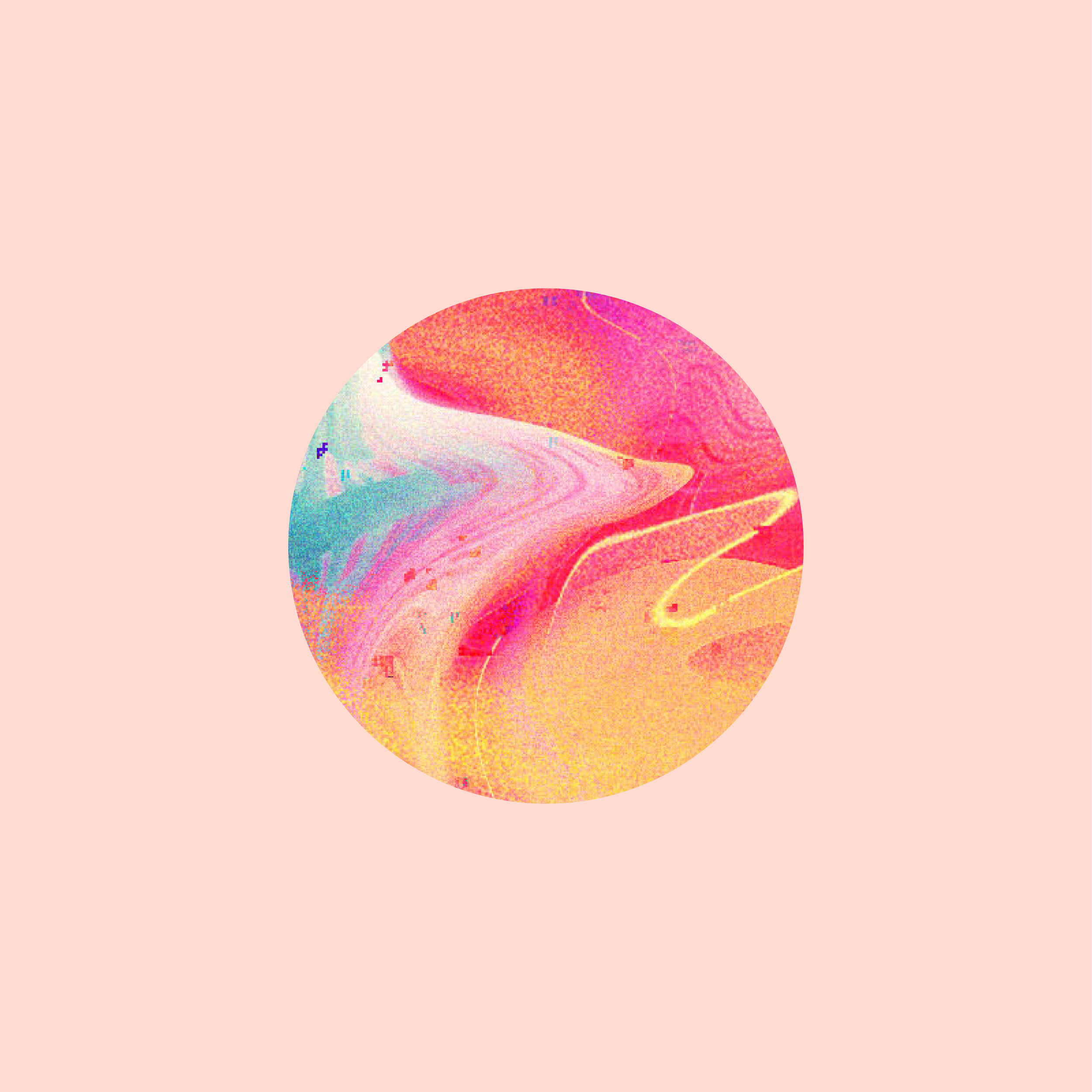
The Cranberries, Dreams • Designed by Rylie
I went for nostalgia and chose my favorite song from the soundtrack of my early childhood: Dreams by The Cranberries, released in 1993. I drew much of my inspiration from David Carson’s grungy and experimental design work that defined the alternative music scene of the 90s. It’s a love song, so that’s my rationale for the imagery. I sourced and scanned the photograph from a stock photo book that was appropriately published in the 90s. I tried to keep it relatively authentic to the time period. I altered it in photoshop by converting it to a texturized bitmap, then went for a color palette that looks like something out of a dELiA*s clothing catalog. I used this exercise as an opportunity to experiment with incorporating traditional media digitally. I got messy with charcoal, and the result is very maximalist. It’s layered, heavy, and light all at the same time — just like the song.
– R