Design Prompt 3 • Ice Cream Pint
Anyone else consuming ice cream like crazy in this heat? If you’re anything like us, you definitely are. We felt it was only fitting to create our own ice cream brands & packaging concepts for this months design prompt.
The brief :
It’s summertime so let’s design an ice cream container!
01
Choose an existing brand or makeup your own!
02
Make sure your artwork includes name, logo, flavor and net weight. The rest is completely up to you.
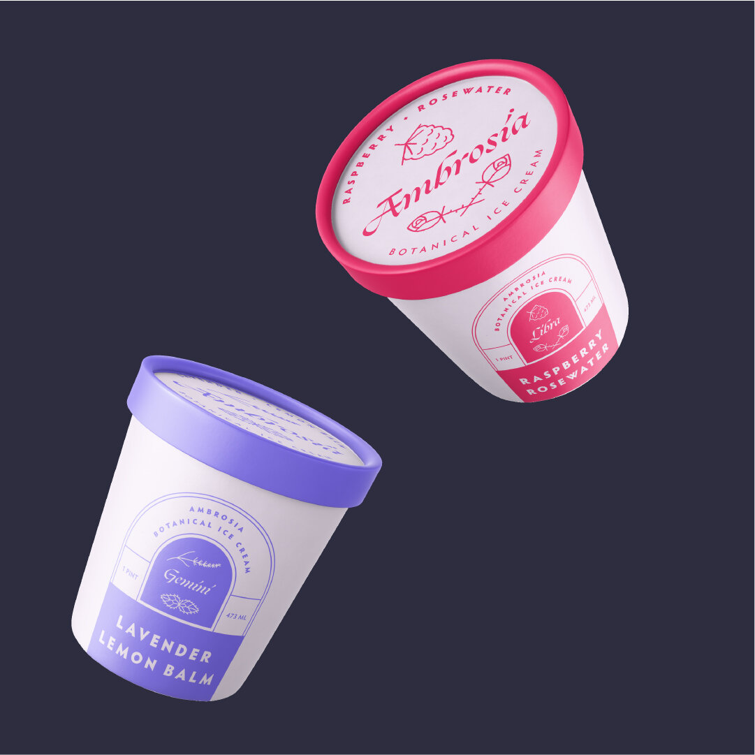
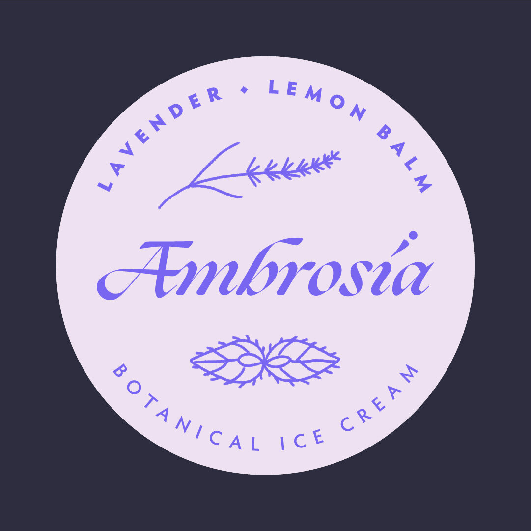
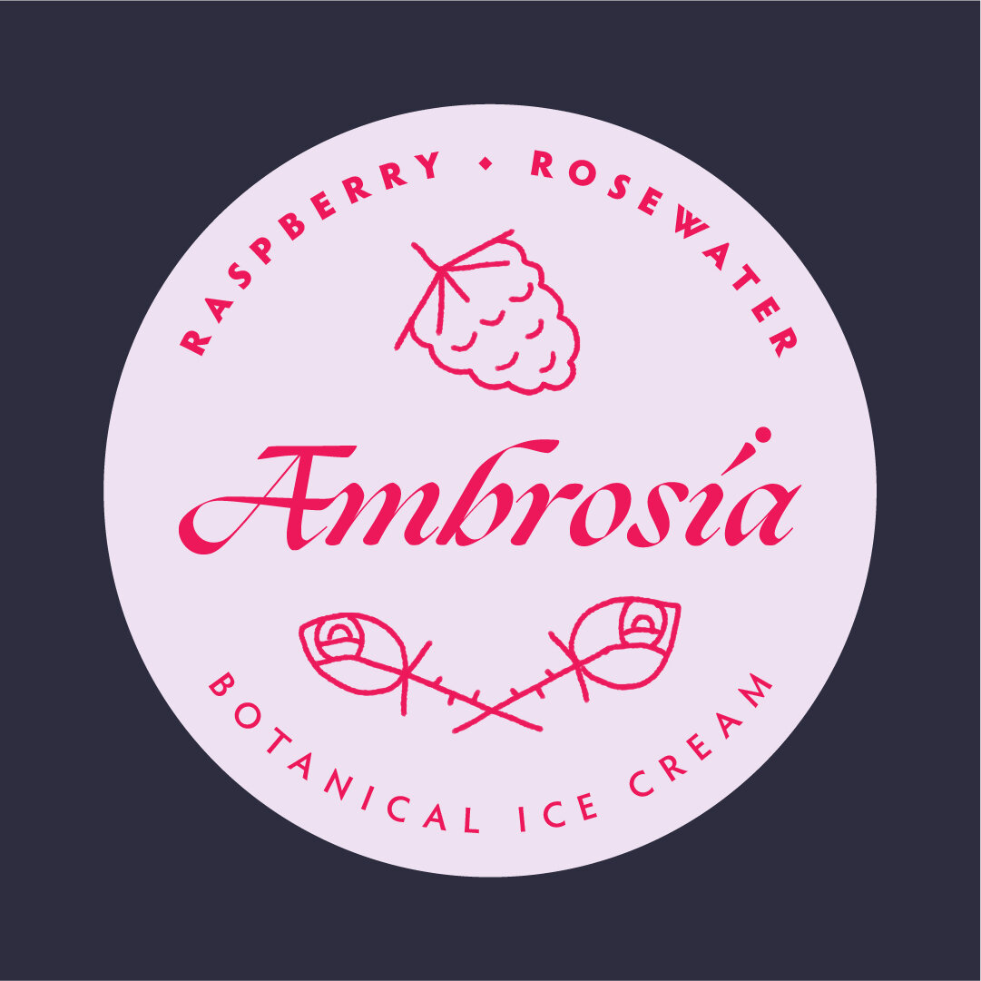
Ambrosia • Designed by Rylie
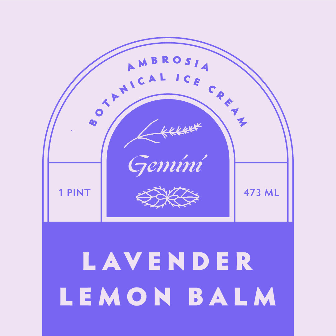
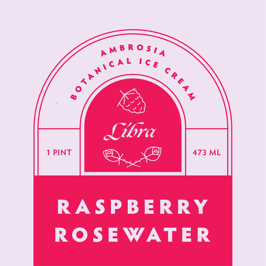
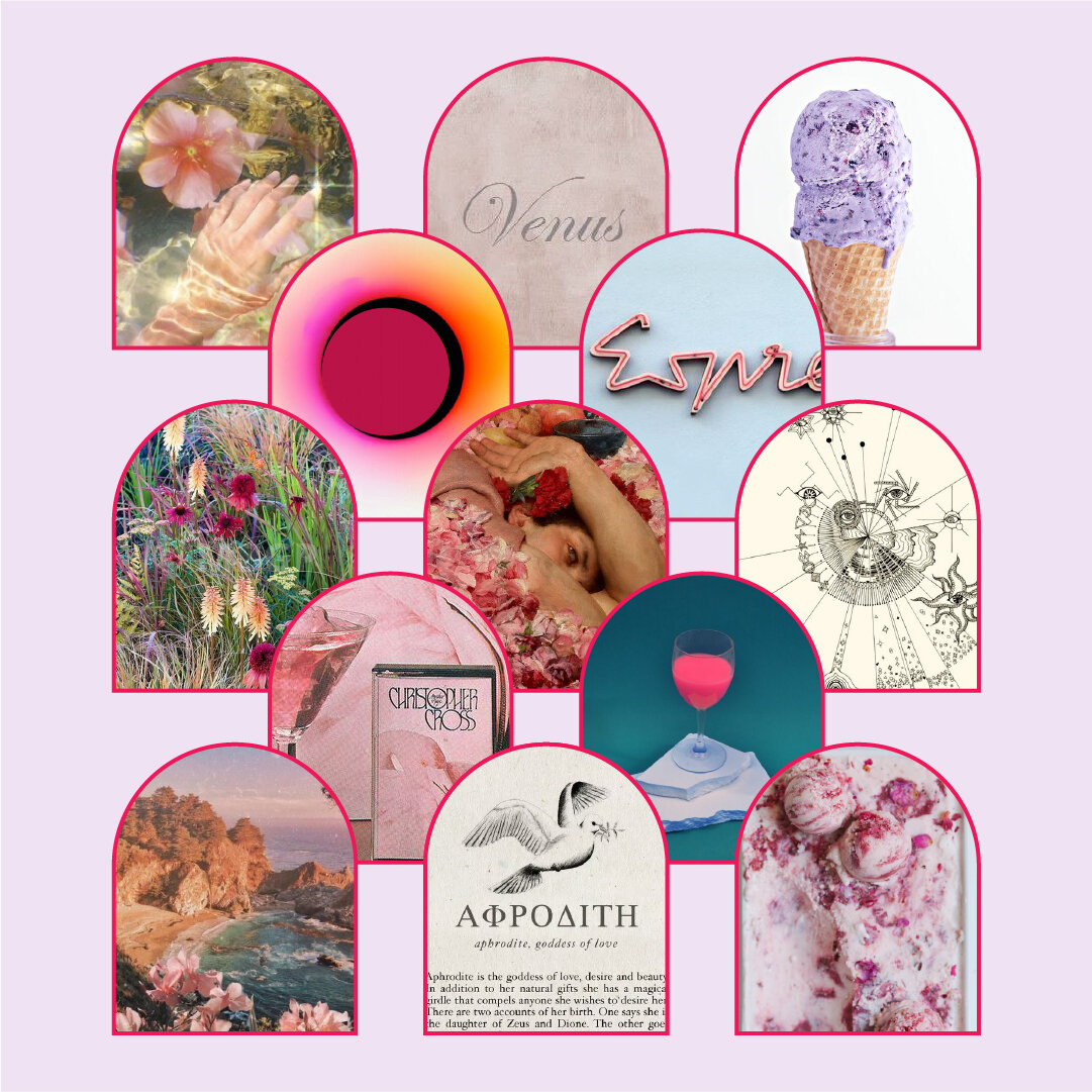
I’m a big fan of floral flavors in desserts. I consulted the thesaurus for floral-related words and came across “ambrosia”. This sent me down a rabbit hole researching greek mythology, leading to astrology, and eventually a 17th century physician – Nicholas Culpeper, whose life work was astrological botany – linking the medicinal use of plants to planetary alignments. Super interesting stuff.
I based the flavors of the ice cream on plants that correspond to specific zodiac signs according to those 17th century documents. The design is inspired by ancient Greek architecture, typography choice by Greek manuscripts, and the semi-fluorescent color palette keeps things fun. I personally don’t believe the stars influence my life, but I’m a sucker for anything personalized with my zodiac sign.
– RB
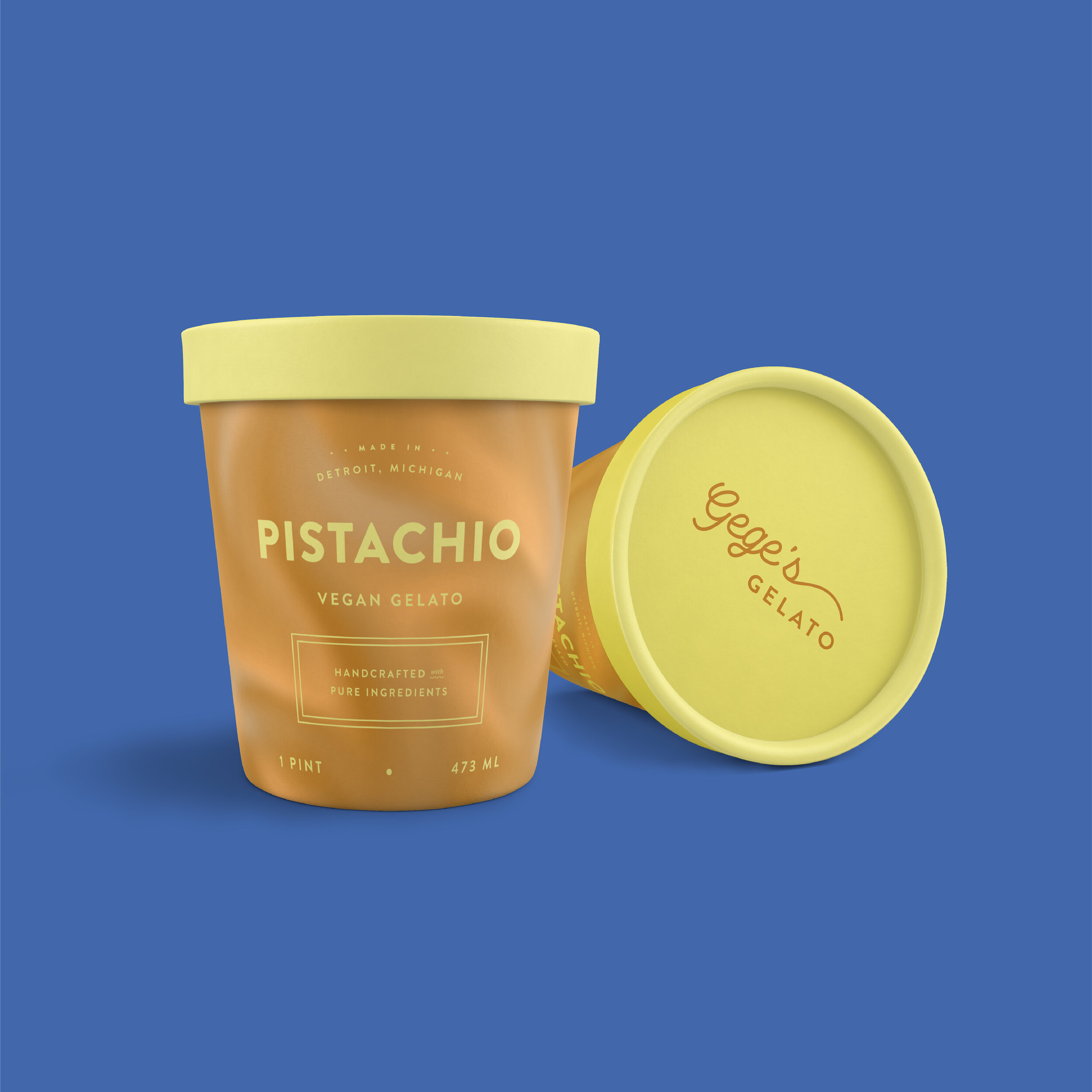
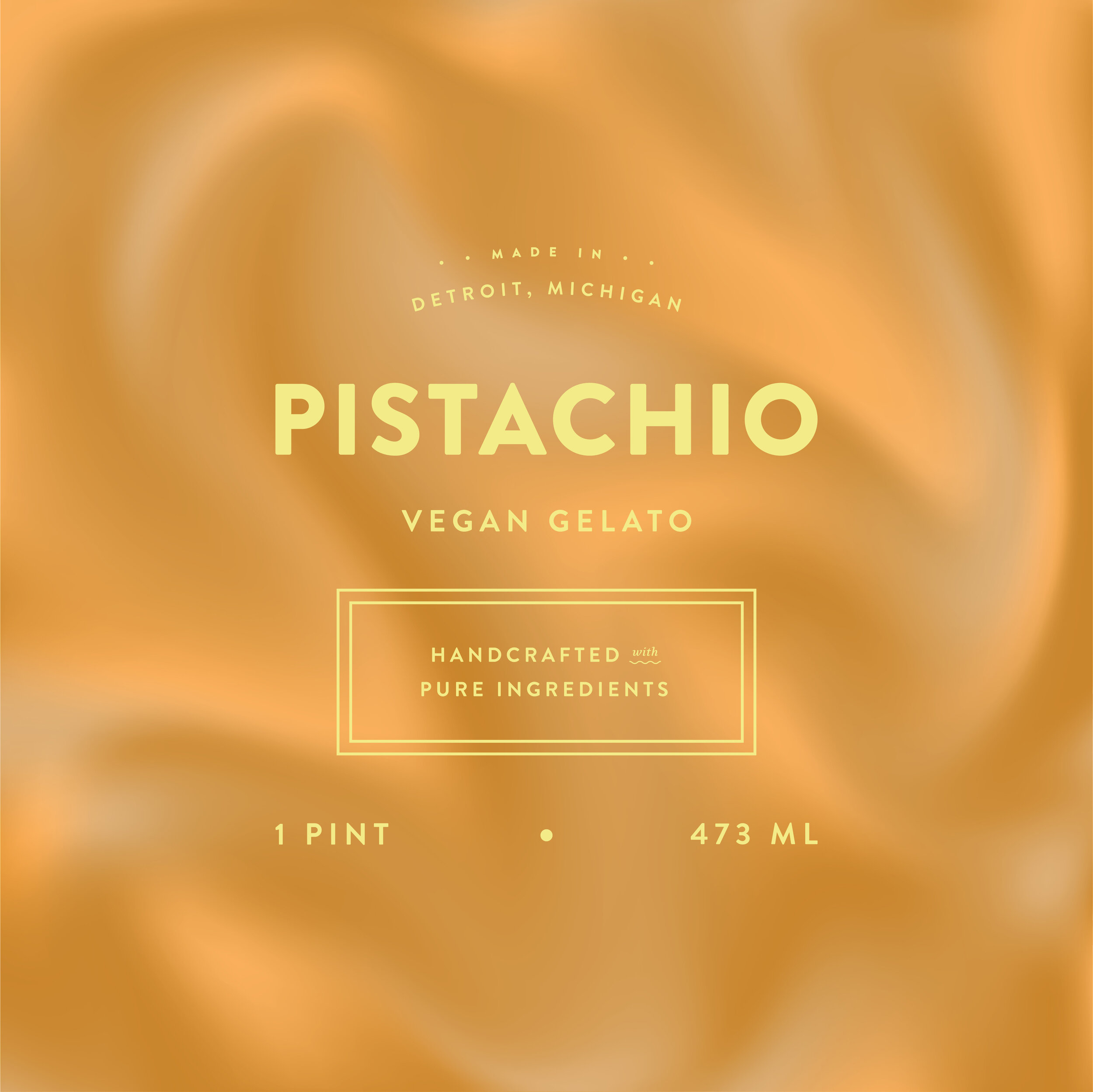
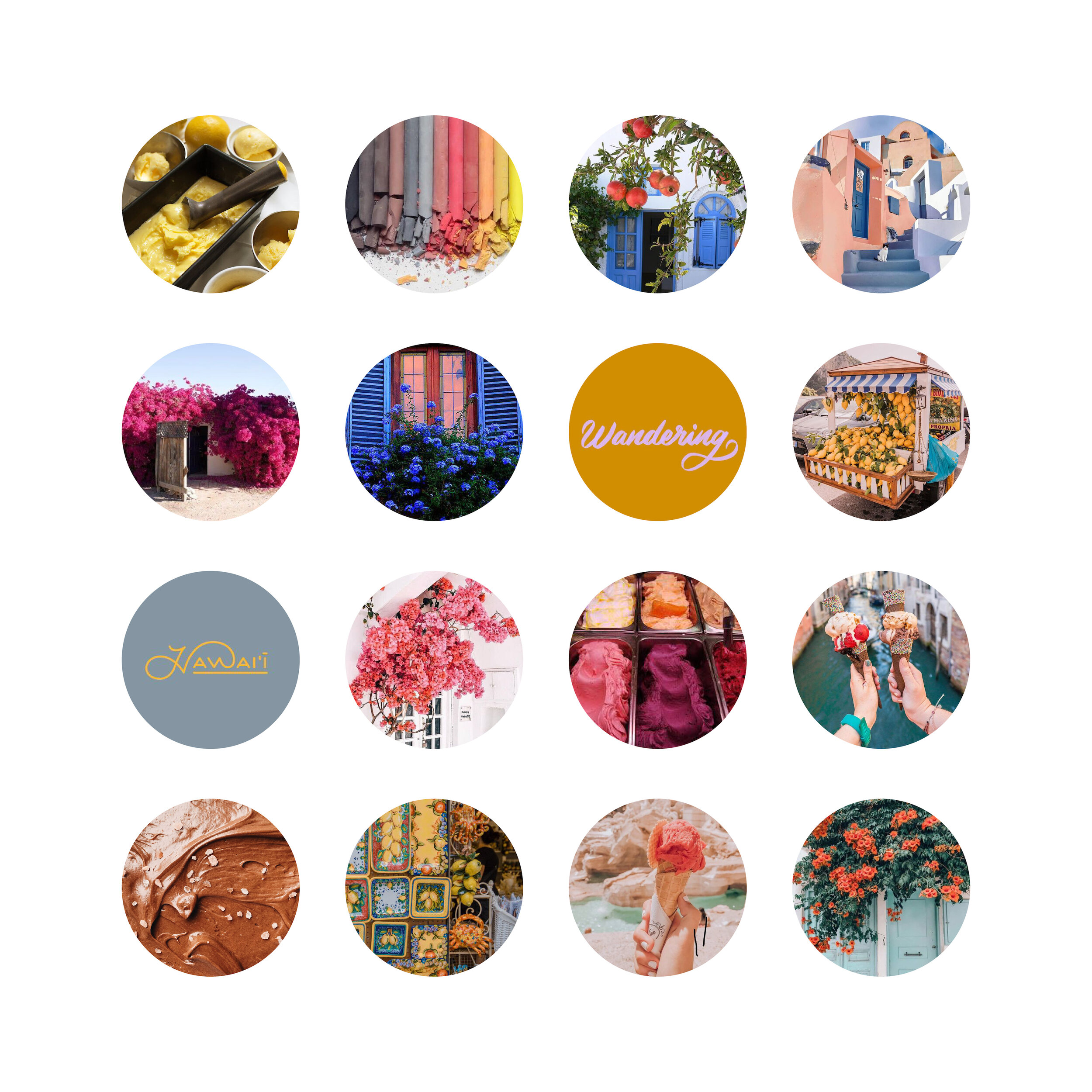
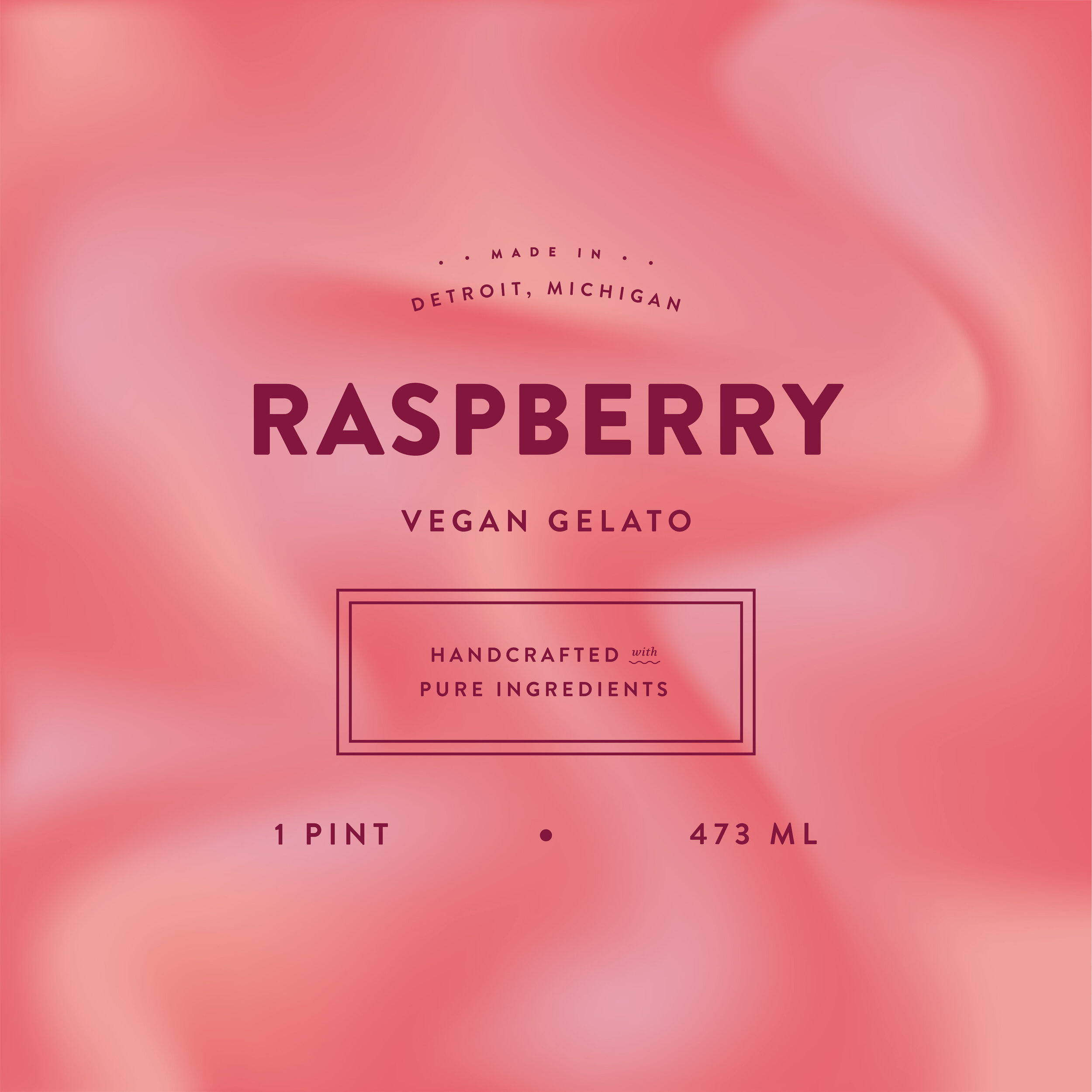
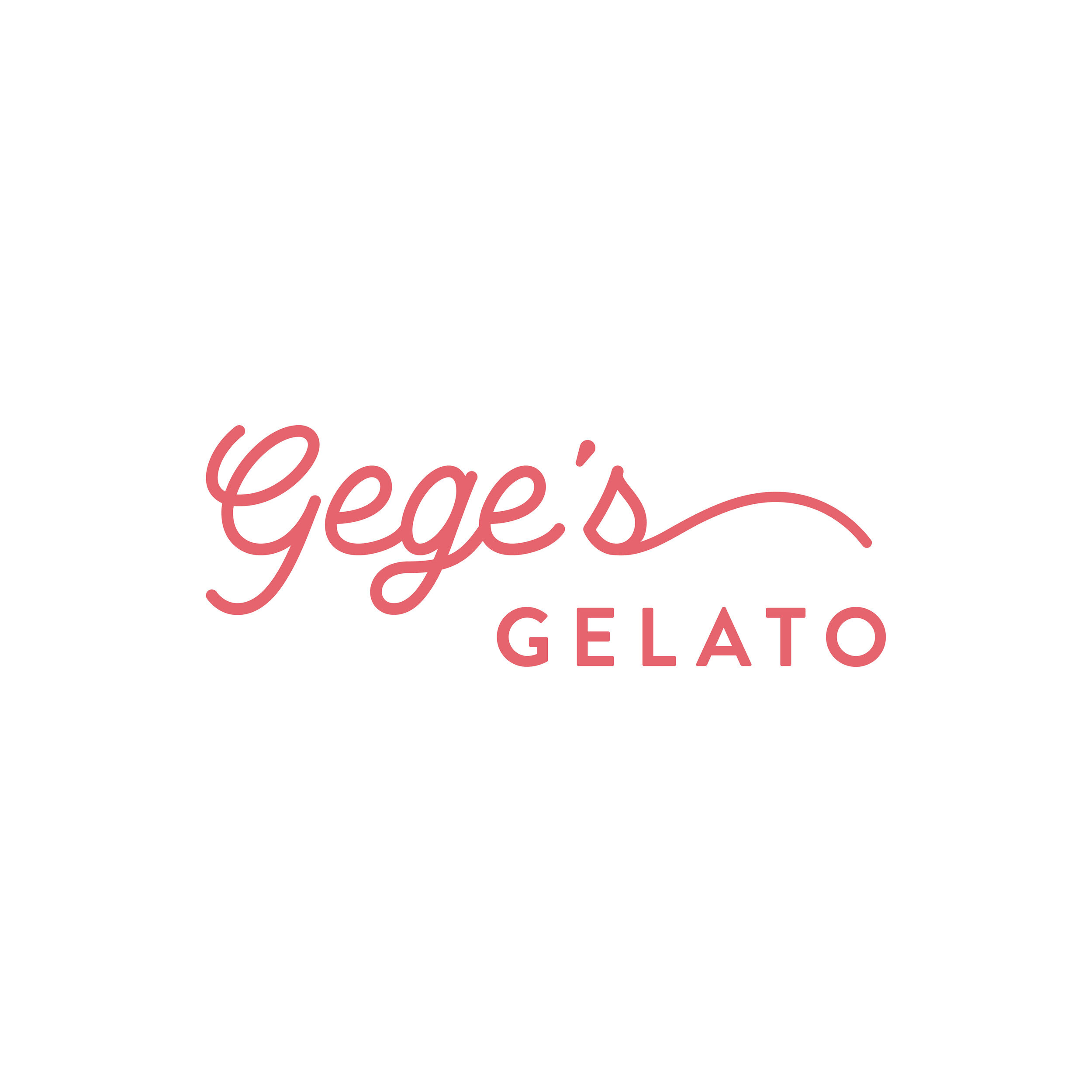
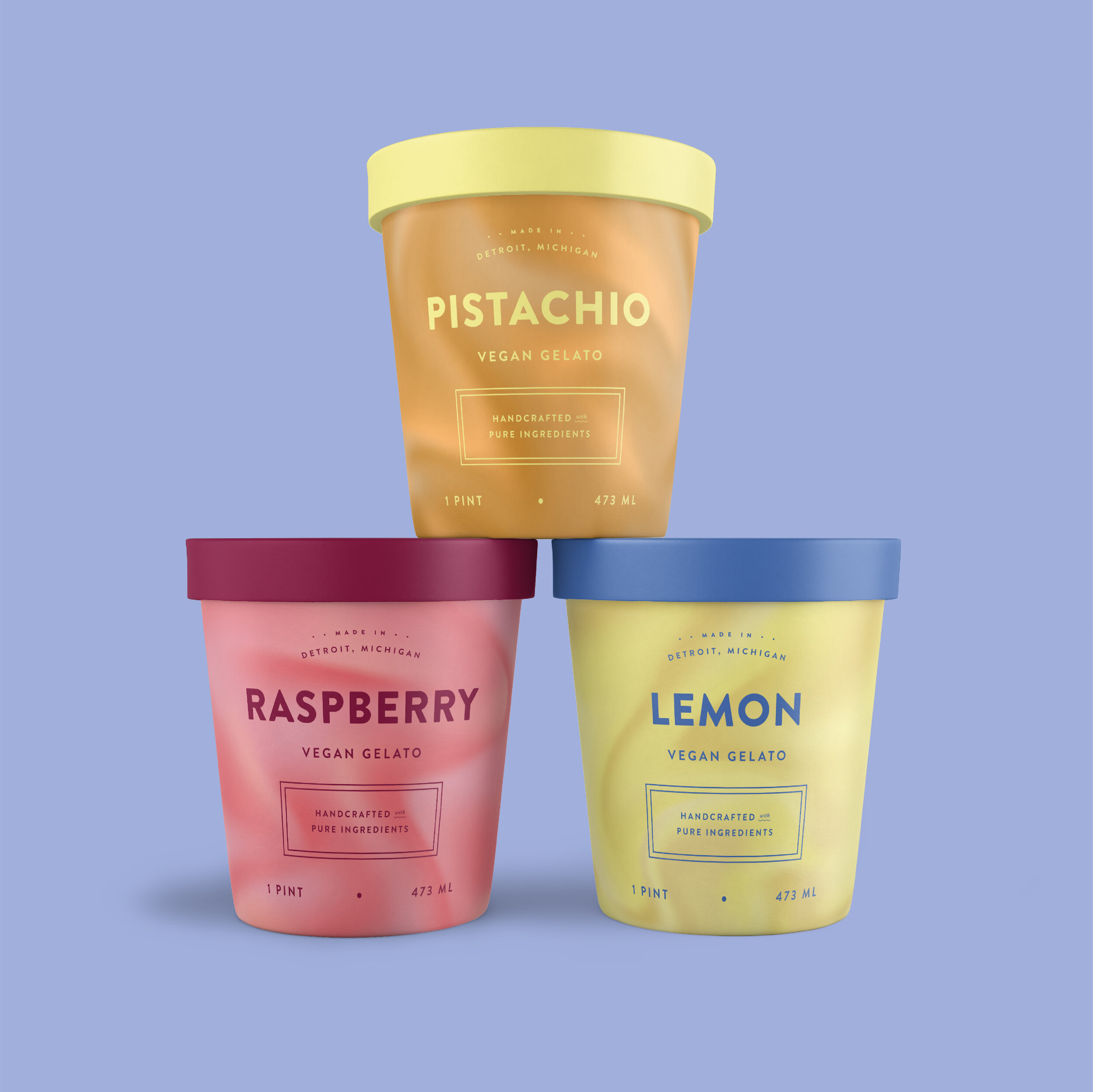
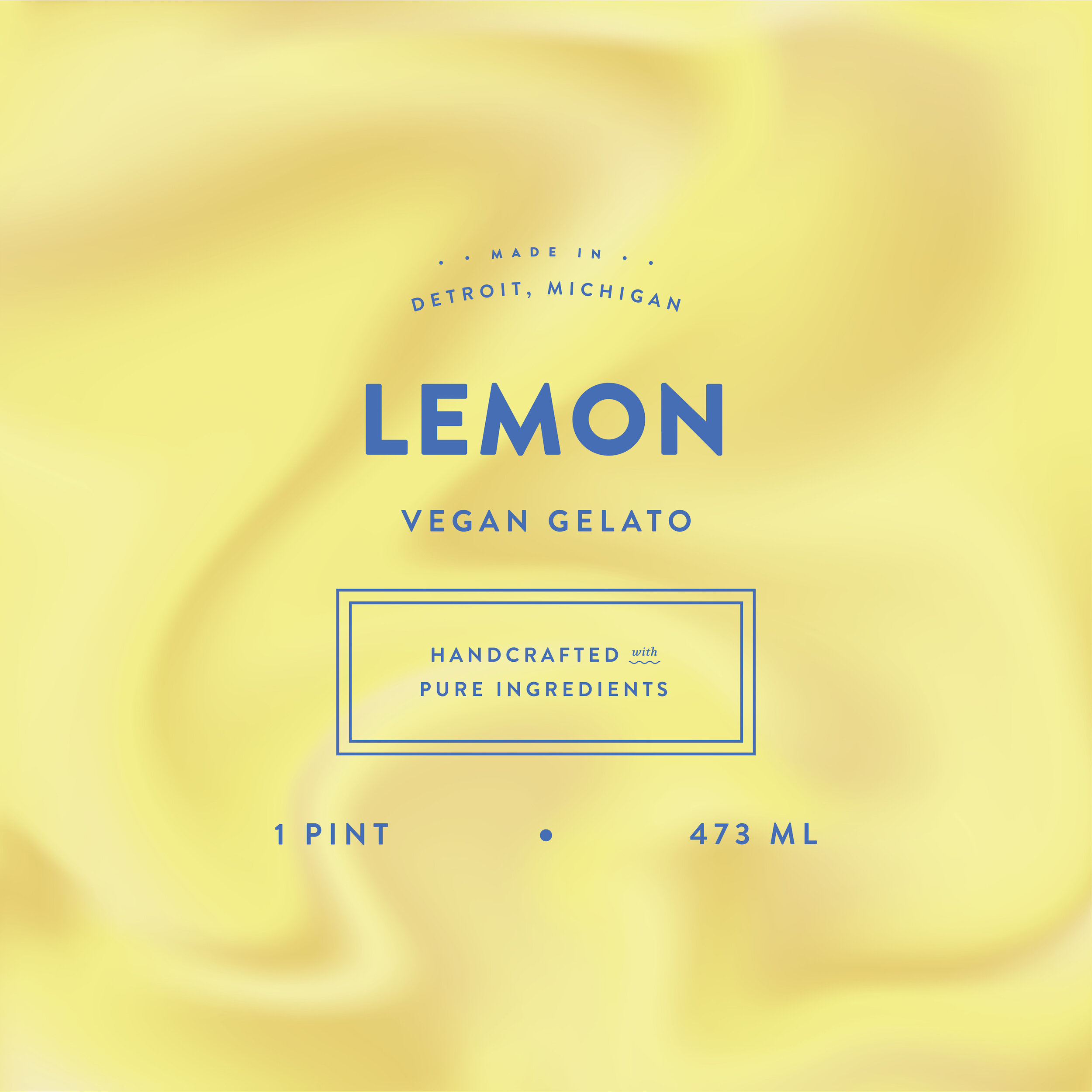
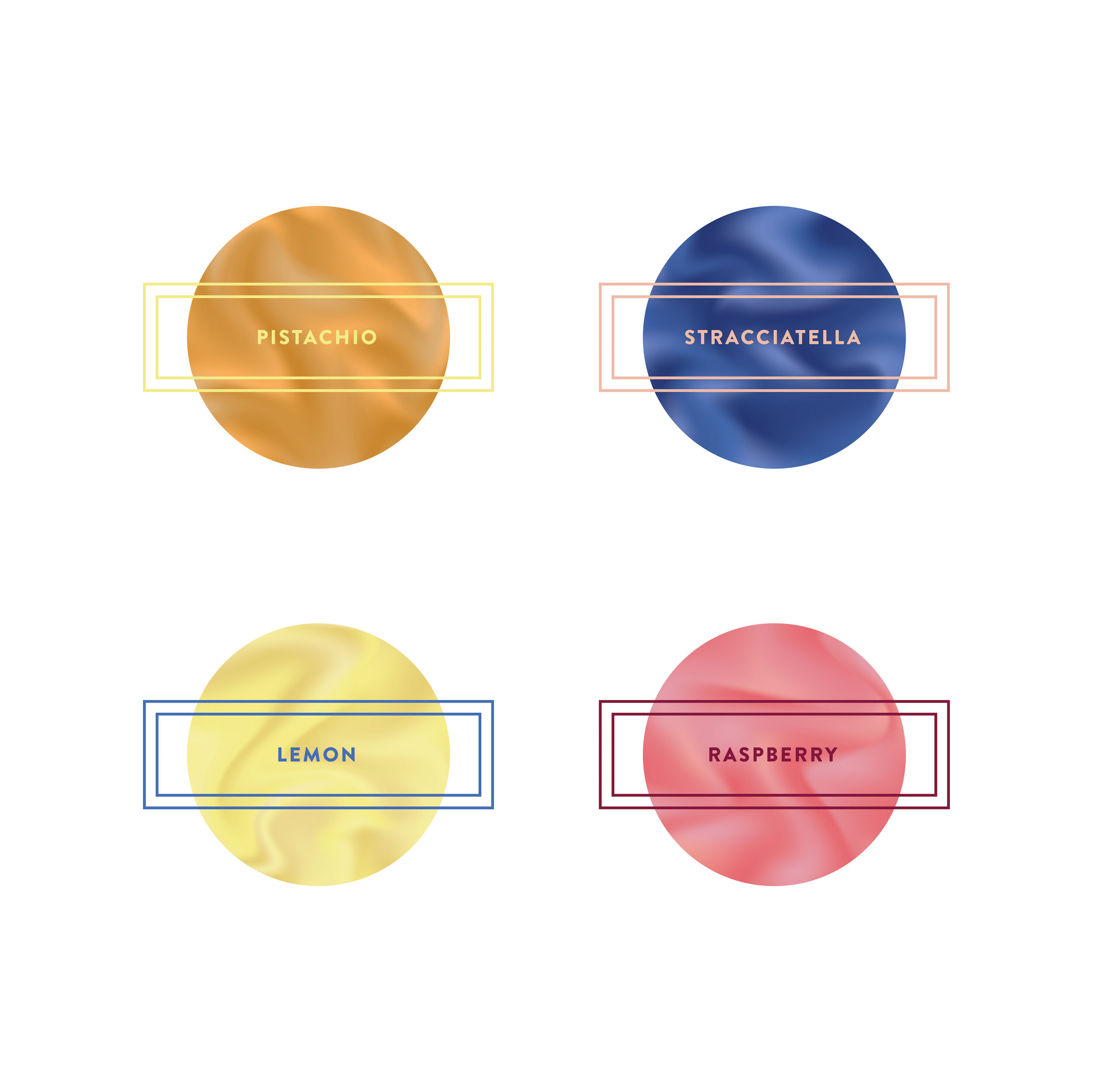
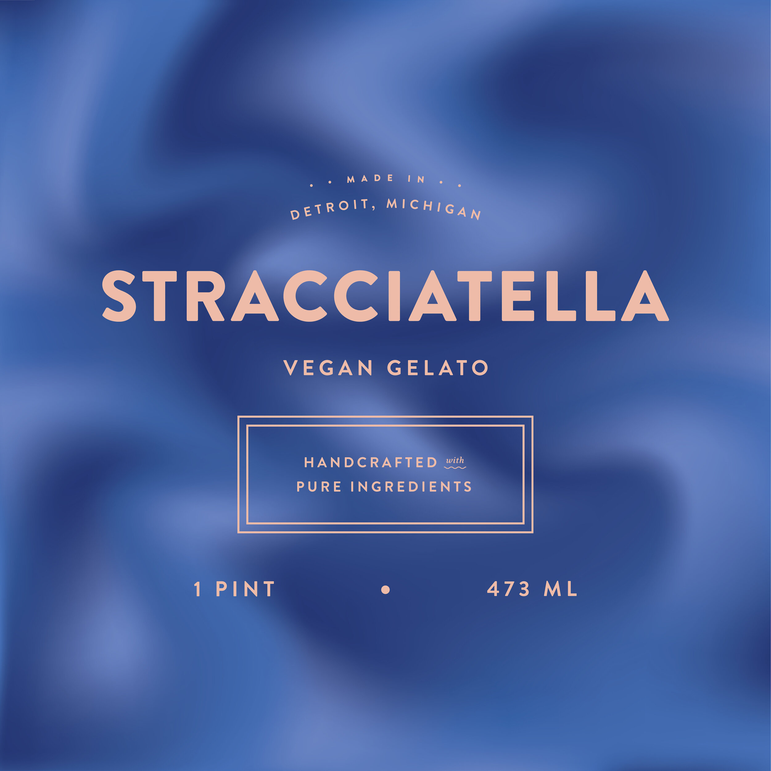
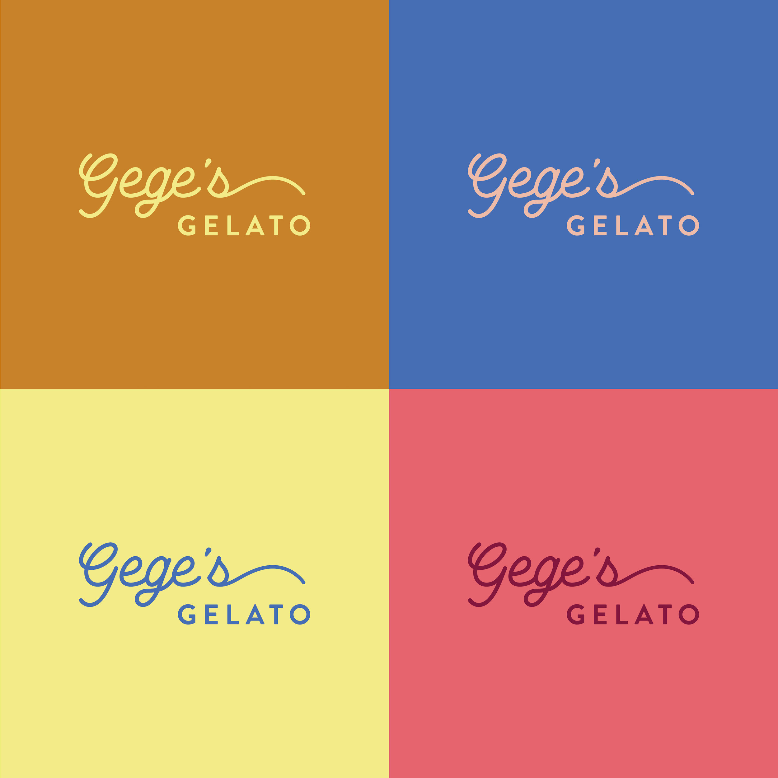
Gege’s Gelato • Designed by Genevieve
Guys – this prompt gave me all the wanderlust, nostalgic feels. As a Sammarinese-American I’ve had my fair share of gelato on our trips to Italy. There’s nothing quite like walking ancient streets with flavorful scoops in hand during the summer months. For me, gelato reminds me of time with my family, exploring new areas and learning about my heritage.
When I think of gelato, the words decadent, pleasureful, creamy, flavorful, and luxurious come to mind. Keeping those adjectives at the forefront, I developed background textures for each flavor that mimic the swirly, smooth appearance of gelato paired with a saturated color palette to create a bold, clean and recognizable packaging system.
Enjoy!
– G
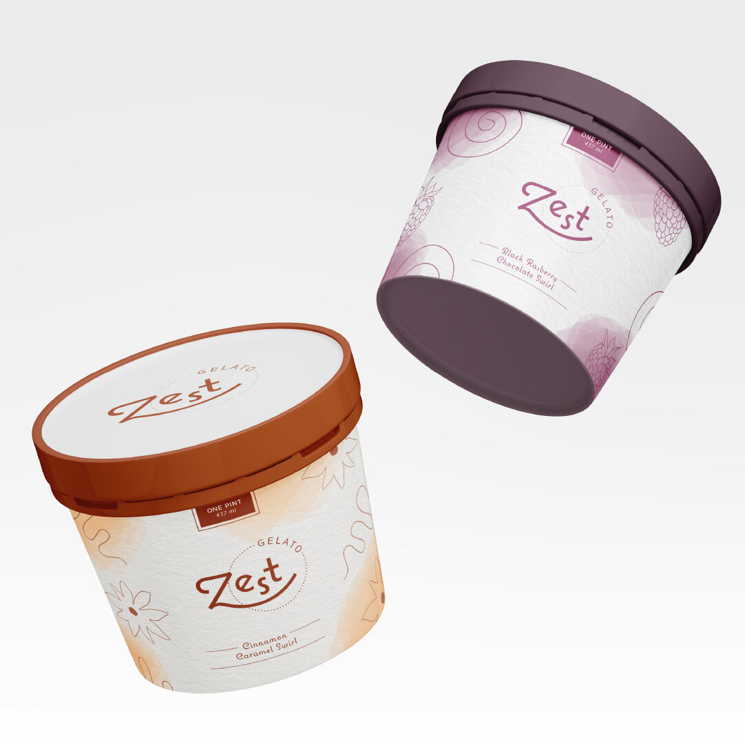
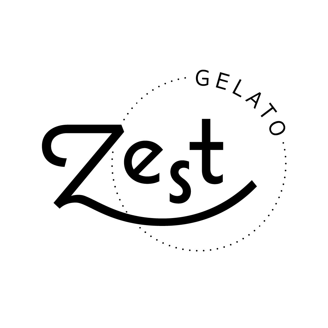
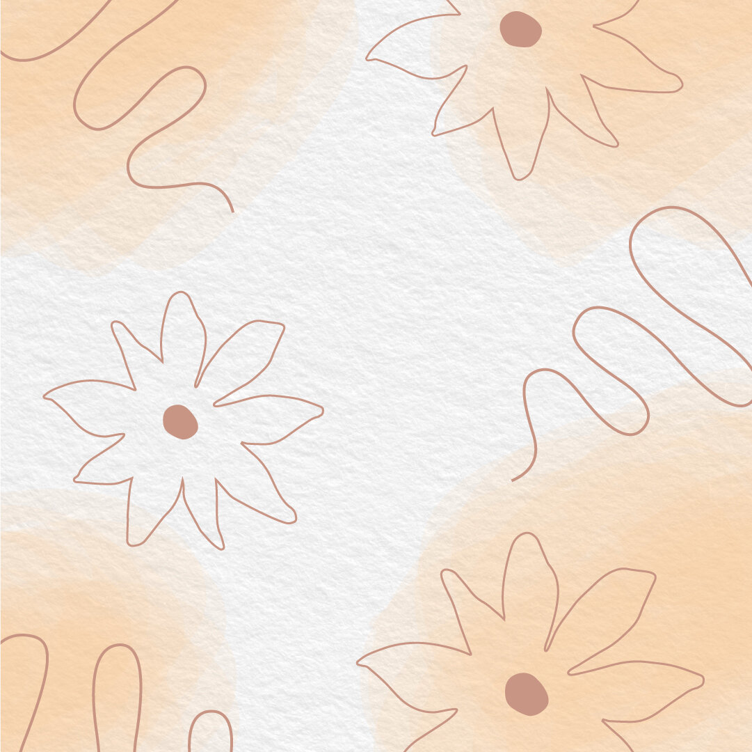
Zest Gelato • Designed by Alicia
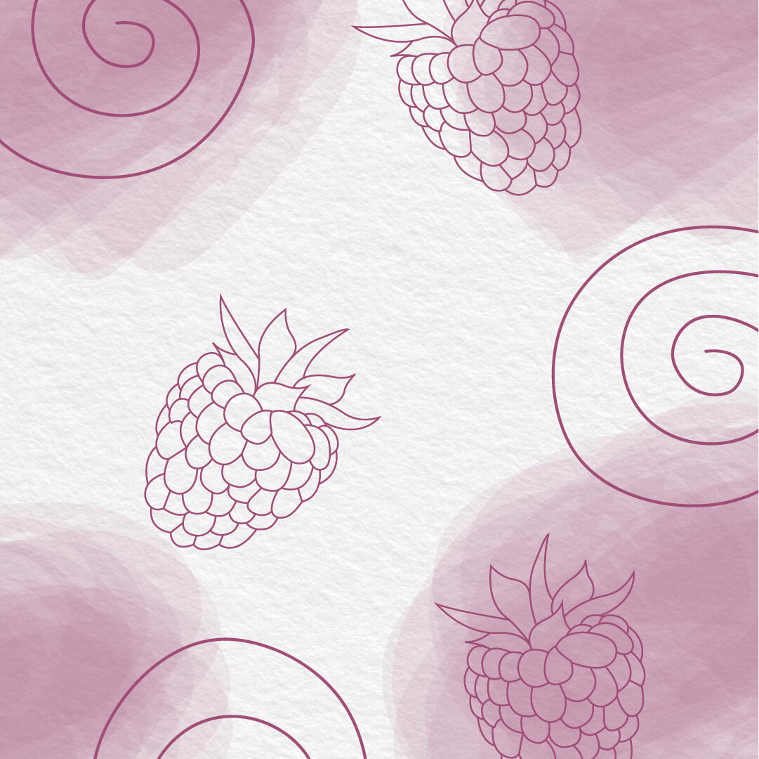
I decided to create my own gelato ice cream brand and packaging. I went to Italy last year and fell in love with all the gelato they had which is what inspired me to go in this direction. I came up with the name “Zest” for the gelato company because our flavor combinations are exciting and bold. I looked at bright colors and water color inspiration for elements that could be used in the branding.
The decisions behind the designs – I chose a typeface that had a fun and quirky feel and customized the Z to have a slight curve just like scoops of gelato. This is also why I decided to use a circle to contain the qualifier “gelato”. I created my own water color textures on paper and later refined them digitally to use as background elements. Next, I created custom illustrations that represented the flavors you see. The colors were chosen based on the flavors.
– A